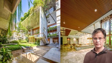
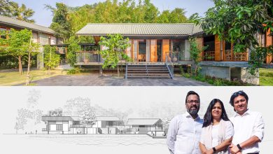
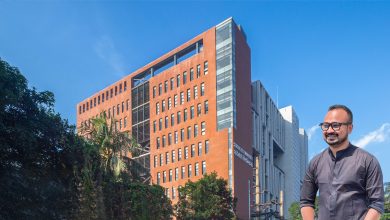
Elegant and Opulent – Barobi Design Showroom
The showroom of Barobi Design in Banani is spread across two floors spanning about 4000 square feet. The place offers a versatile design that is executed elegantly by Enola Niaz, architect of Barobi Design.
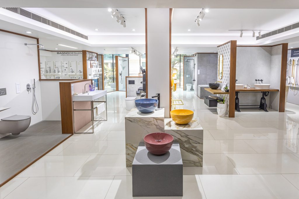
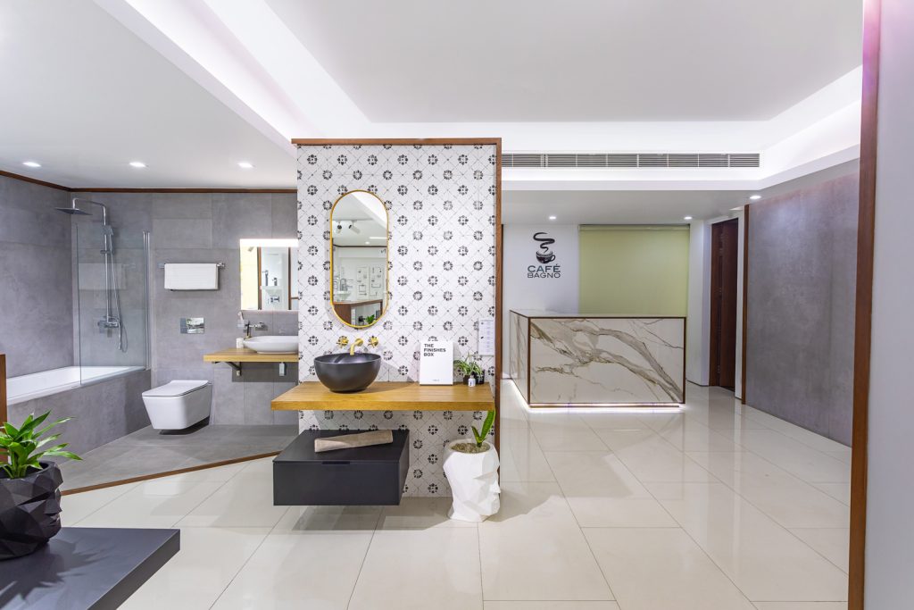
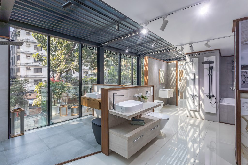
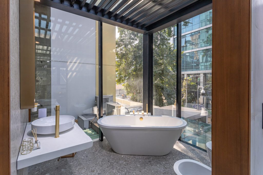
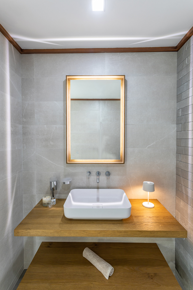
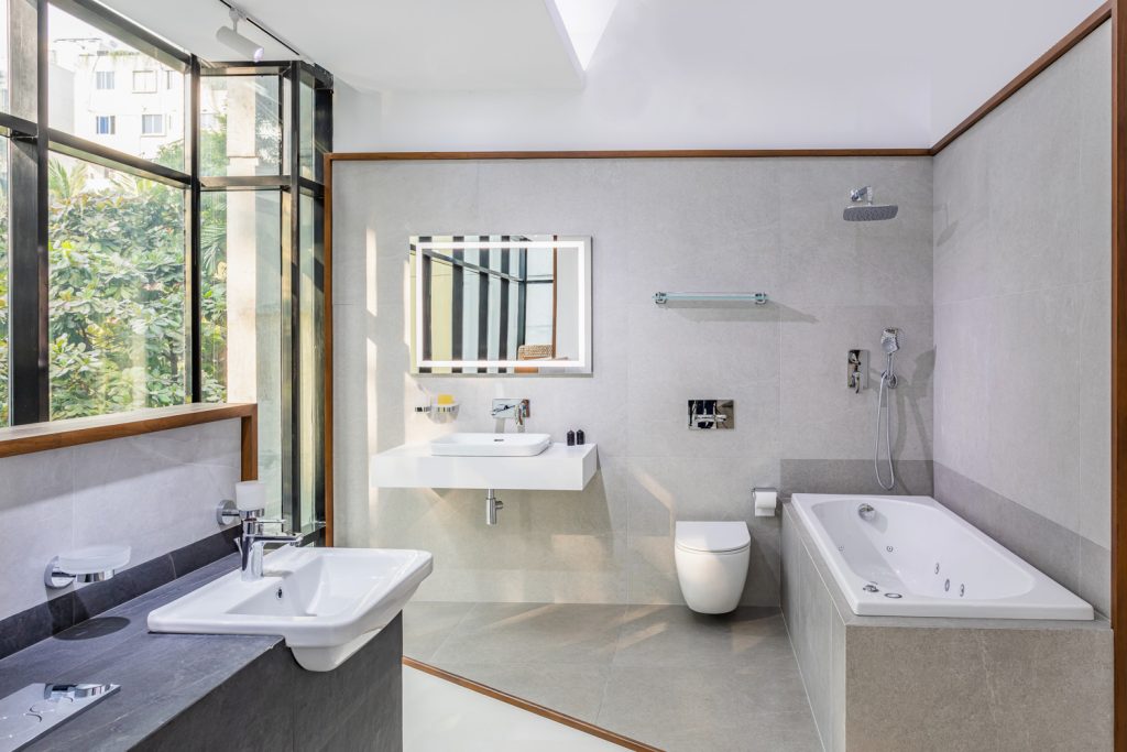
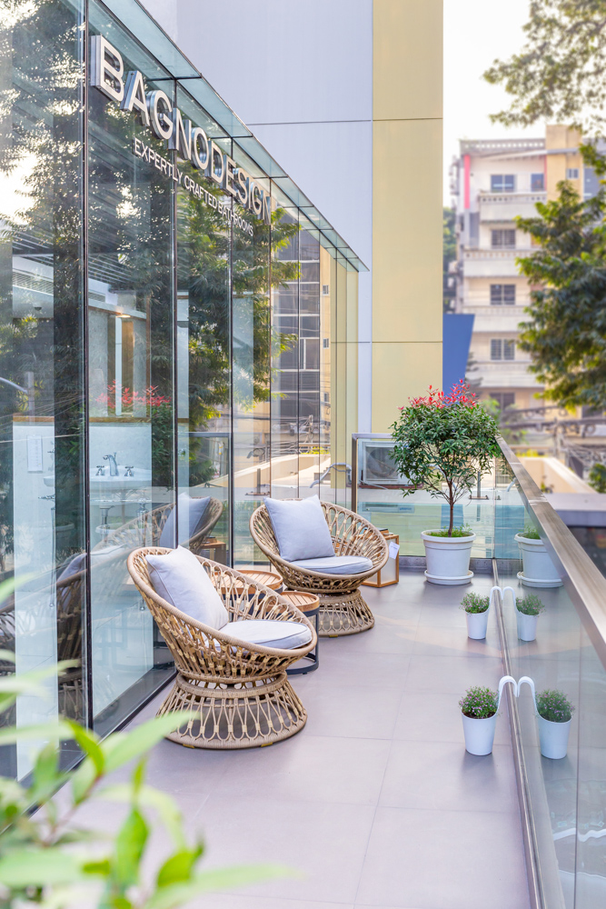
Barobi Design is the exclusive distributor for BAGNODESIGN – London in Dhaka. It serves the clients with the best of luxury sanitary ware, brassware and tile products of high quality and latest innovation. It gives the bathroom a modern and timeless look. Utilizing the most recent trends and technology, the talented team of architects and engineers of Barobi Design will take care of the client’s needs for both commercial and residential bathrooms. It provides all products that a bathroom needs which includes wash basins, furniture, faucets, accessories, bathtubs, shower trays, shower screens, shower spaces, spas, smart toilets, installation systems and tiles for indoor and outdoor use. The most cutting-edge technology is combined with the most recent design trends in every product of Barobi Design. Mr. Mahabub Alam, Chairman of Barobi Design, was impressed after using the sanitary products exclusively for the remodeling of his own home here in Dhaka. As a result, he made the decision to introduce cutting-edge products and first-rate services to Bangladesh, a country with significant potential for expansion in a variety of industries, from residential to retail.
Construction of the showroom began in the middle of 2019. According to Enola Niaz, COVID made the process take two years to finish. Since 2021, Barobi Design has been giving its customers the foremost quality service. The brand provides products that meet both the top luxury and affordable categories. For instance, BAGNODESIGN is shown more prominently on the first floor, which also features more expensive, opulent, and colorful products, while Aqua Eco, Dolphin, and SANIPEX Group are located on the second floor, which caters more to the mid-range market. The end result guarantees that the items, either alone or in combination, seamlessly fit into a range of settings. The distinctive design comprises a variety of black, adjustable frames that can be customized according to the requirements and purposes of the user. BAGNOTEC and BAGNOQUARTZ are examples of composite stones that are used for sinks, baths, and toilets. Their profound structure is made to accommodate a countertop made of wood, marble, or stone in addition to the basin.
The product’s many different components may be assembled in a variety of ways, offering a variety of solutions, and making the design appealing to a wide range of aesthetic preferences.
The products distinguish from one another majorly is through the colors they offer; for instance, you can select between rose gold and the somewhat infrequent Zanzibar matte gold, which is difficult to find in the market. A sizable selection of Italian tiles is also available at Barobi Design. “Barobi gives you a one-stop solution, which means they don’t cause their customers any worries; instead, they’ll be there to remediate all your concerns”, expresses Ar. Enola Niaz.
The showroom offers professional and private clients’ easy access to a complete lifestyle solution all under one roof. Featuring inspirational displays and carefully curated collections of on-trend quality products from its own BAGNODESIGN and AQUAZONE brands alongside those of leading European manufacturers.
Text by Tania Ahmed Nishi
A Sophisticated Serenity – Green Lounge, Bailey Road
The Green Lounge restaurant’s second branch in Dhaka’s popular Bailey Road is paired with a sophisticated and contemporary aesthetic. Designed by AMUR architecture, the fine eatery boasts elegance and refinement where urbanities can feel the rhythm of a dignified aura as soon as they step into the premises.
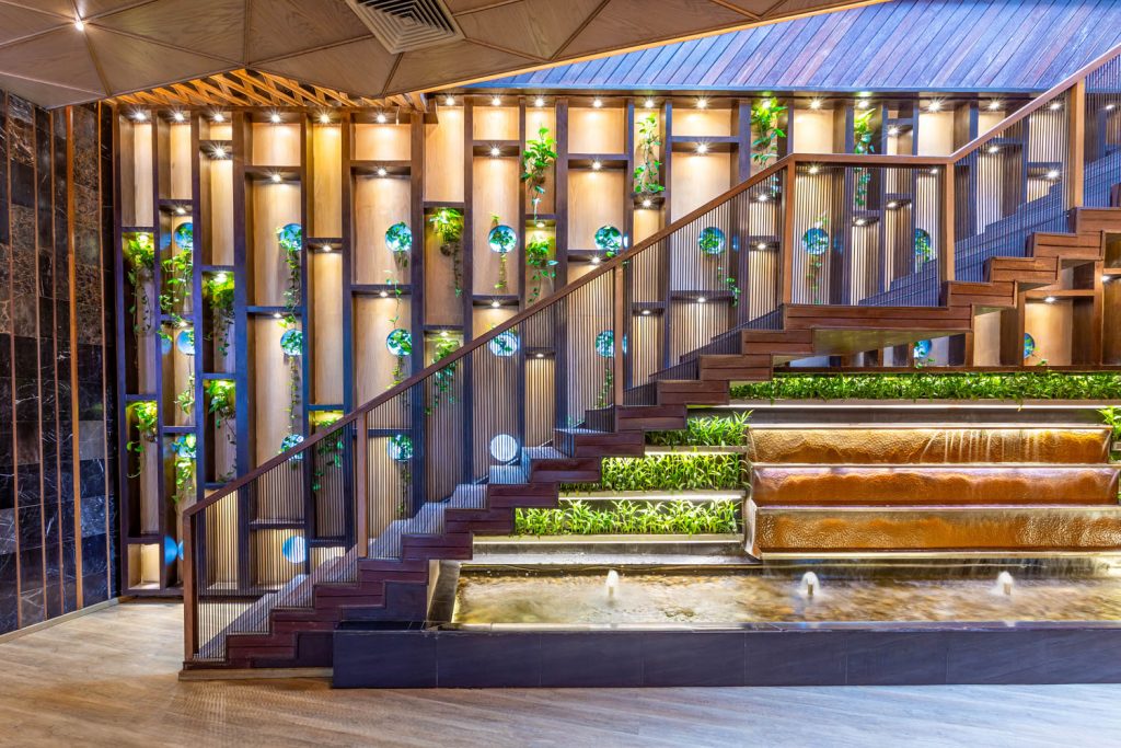
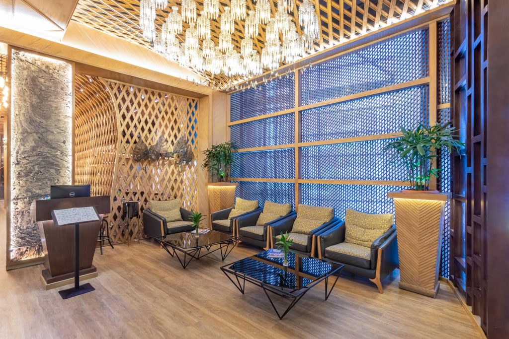
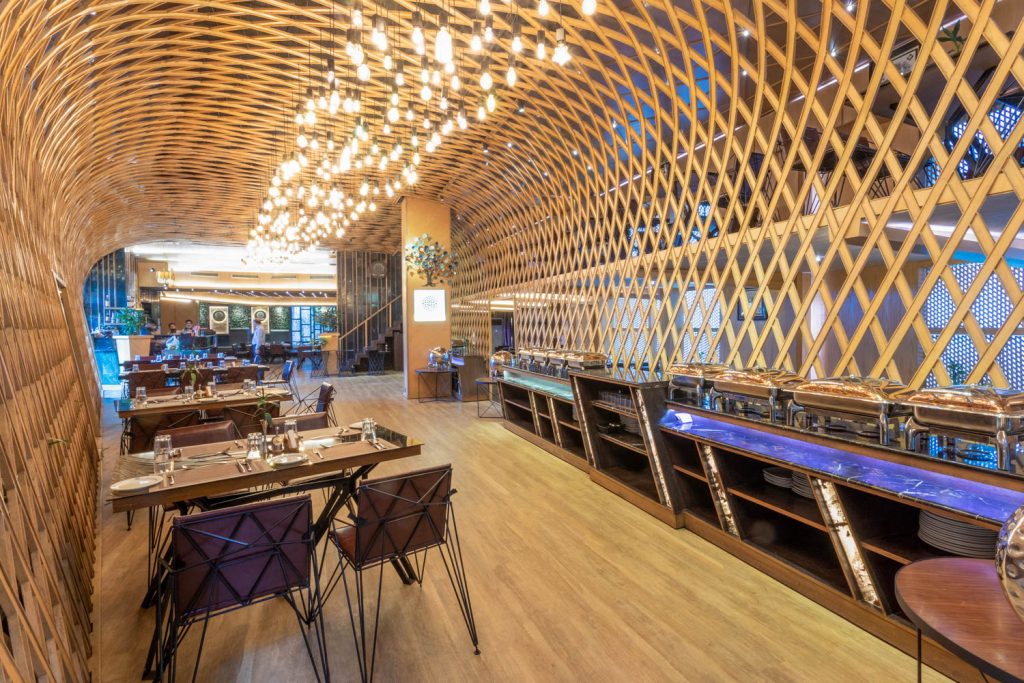
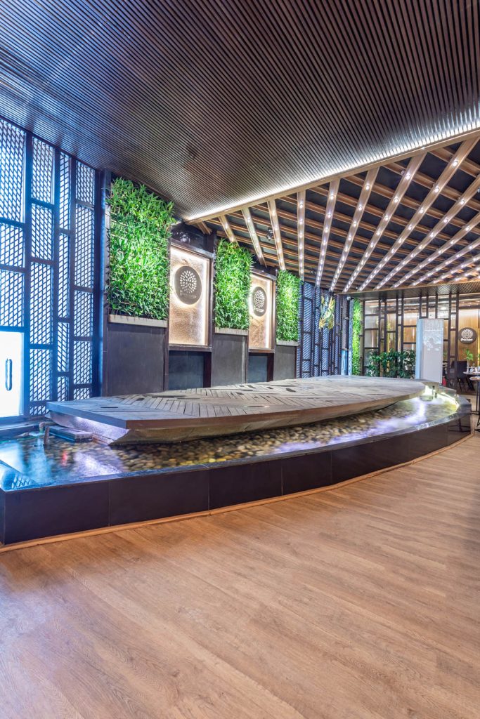
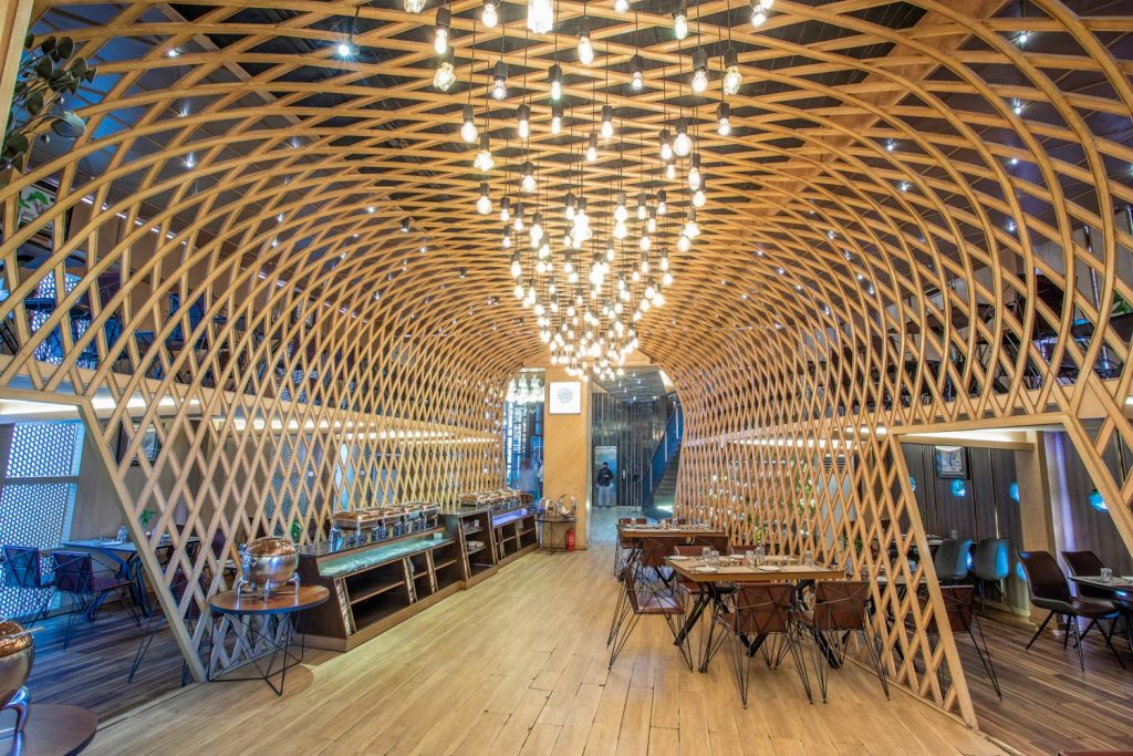
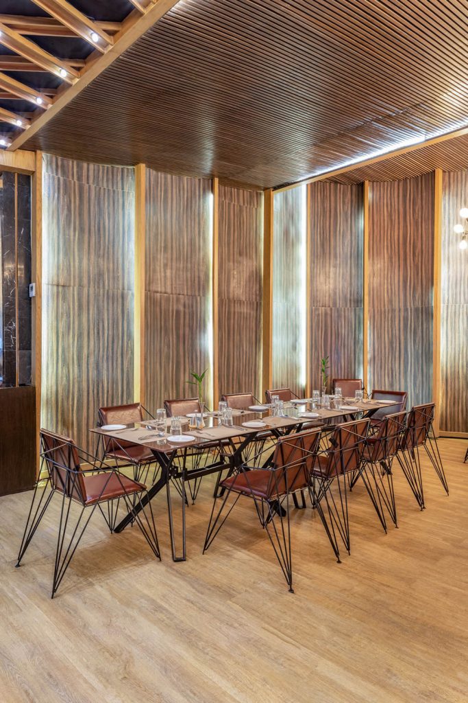
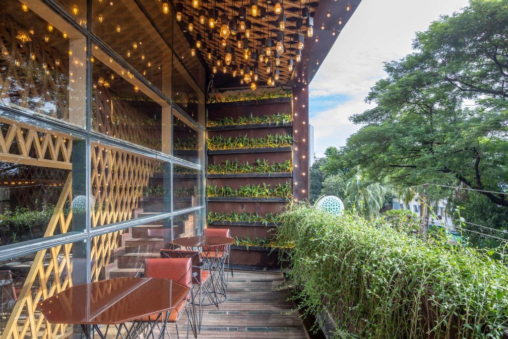
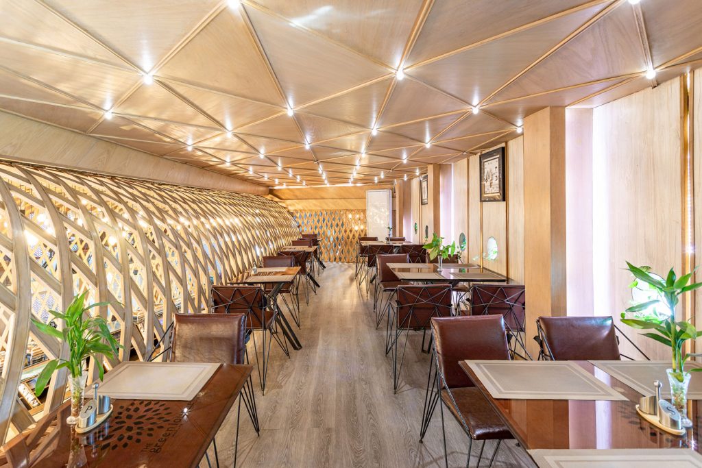
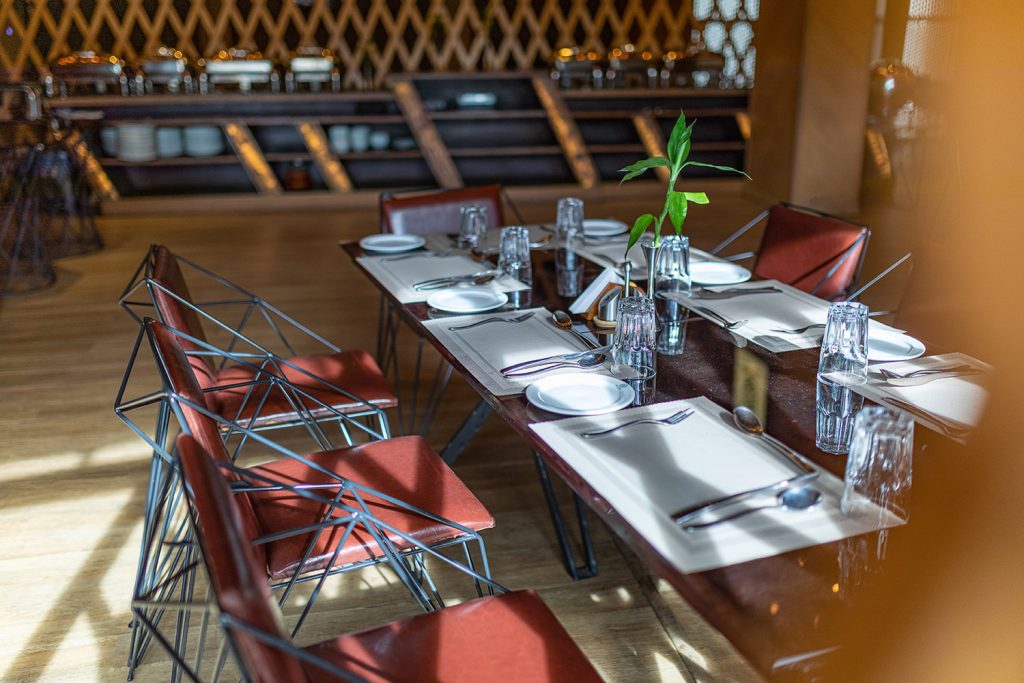
Construction of the restaurant’s interior started in 2018 and was later launched in 2021. Since its launch, the restaurant has become a go-to destination for the Bailey road locals that bring together the passion for food in a serene ambiance. MD. Fazlul Haque, Chairman of The Green Lounge restaurant, co-designed the restaurant’s interior with architect Al Mamun Ur Rashid, principal architect of AMUR architecture. The design concept of the restaurant is inspired by that of a cinema hall. Cinema halls have different sitting zones and similar to that, as the restaurant height is 16 ft, a mezzanine floor is created where guests can choose to sit in the upper section or the lower section. An elevated stage-like space is specifically designed for guests to cater ceremonial events or musical/instrumental performances. Each individual can have an interrupted view of the stage performance sitting in either section.
The mezzanine floor also adds layers and value to the space while also maximizing the sitting capacity of the restaurant. Guests can pick their preferred sitting space and spend a relaxing time and binge on exquisite delicacies: Chicken Teriyaki Ramen, Nasi Goreng, Barbeque Steak Platter, or indulging in the restaurant’s exclusively curated buffet spread. The interior is set with more raw materials, primarily, Oak Wood. A vast vault is formed with metal strings and veiled with natural wood strips. The construction of the vault was quite a challenging task as it required more conviction and technique in terms of joinery and artistry to make it look neat and perfect. For the design team, one of the essential parts of the interior is its color scheme. In this restaurant, natural wood plays the dominant color while some parts of the interior adorn black and grey tones to complement the natural wood color. Ambiance and atmosphere are other key focuses of the design. A lot of indoor plants, vertical landscaping, and natural light have been incorporated making the environment more soothing and sustainable. During the construction phase, some of the walls were abandoned and a few voids were created to bring in natural light as natural light and the air an essential part of the design for the well-being of the inhabitant or ecosystem. As the restaurant locates inside a commercial building and the locale is a commercial area, voids of the restaurant space were planned strategically and on the eastern side, a mesh screen was adopted to ensure privacy and at the same time bring in natural light and air.
The proposal of The Green Lounge was, from the beginning, to be a different place from the rest of other restaurants on Bailey Road; where people would have a coffee for half an hour or spend the whole afternoon tweaking the most varied dishes, in a relaxed natural atmosphere, away from the hustling and bustling concrete jungle.
Text by Tasmiah Chowdhury
Renovation in the Essence of Nature – Sony Square Corporate Office
From an architectural perspective, if we observe closely, we can find a disparity in building layouts in the peripherical regions or downtown parts of Dhaka. Much of the building’s design or interiors in the downtown regions of the capital are overlooked and remain unsung, unlike the buildings in the urban areas. As a consequence, a definite architecture disparity is evident in site-specific regions. However, breaking this rigidity, the Sony Square corporate office sited in the densely populated area of Mirpur brought a contrasting breath of freshness in terms of ideas, design, and execution. The office is designed by Al Mamun Ur Rashid, principal architect of AMUR architecture.
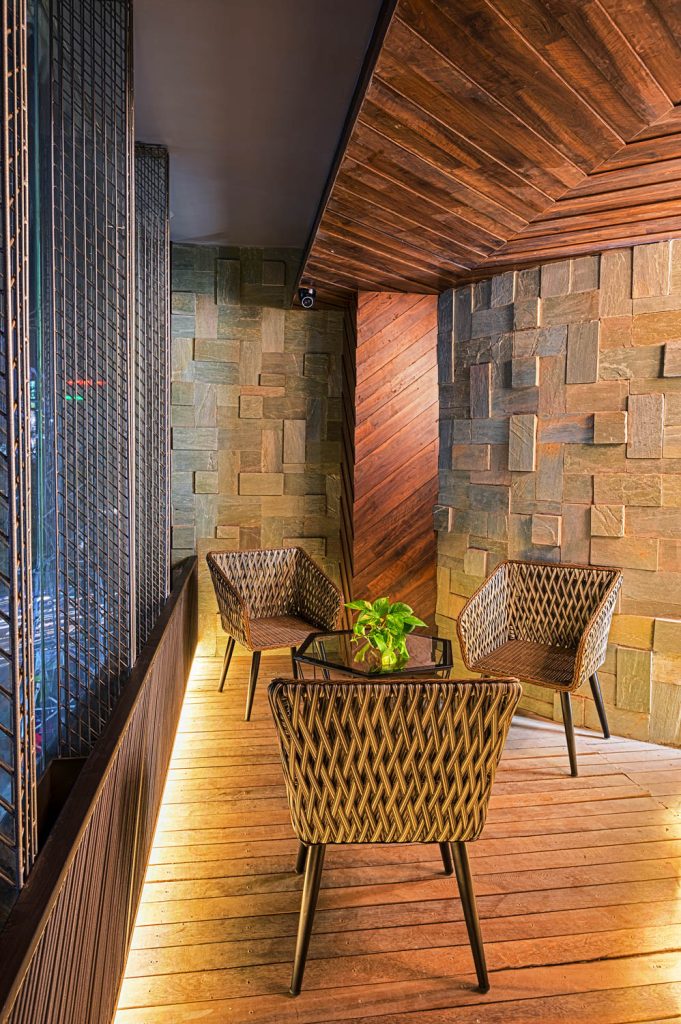
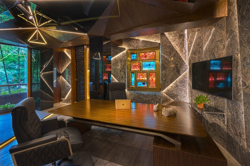
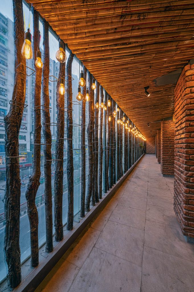
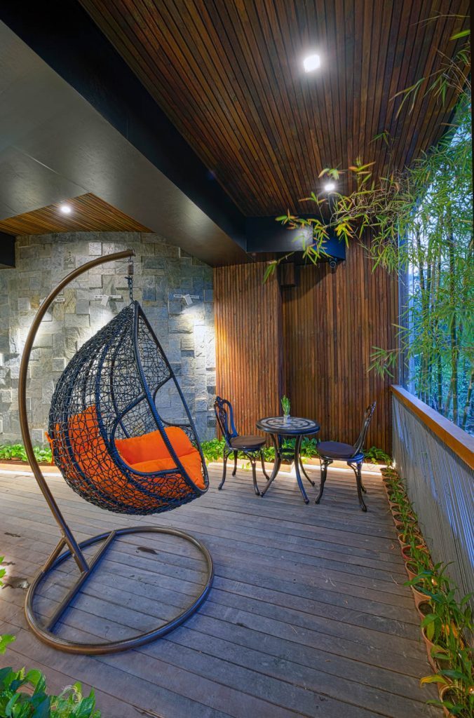
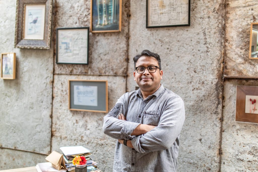
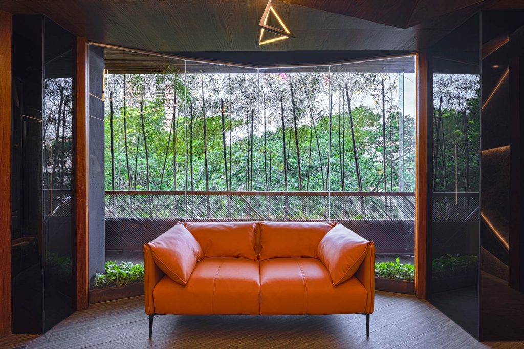
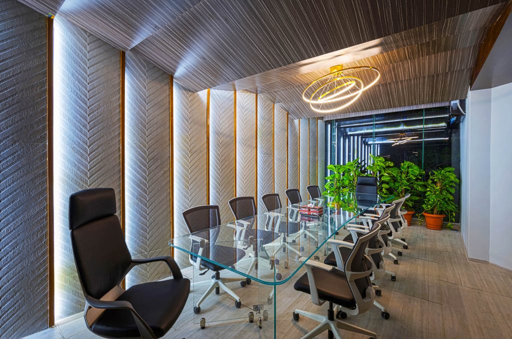
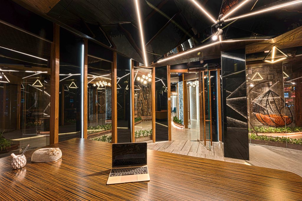
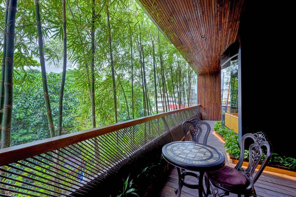
The Sony Square office sought creative solutions to address noise while offering an ample amount of light and greenery. It sets an example that impactful projects can be built in the most densely populated locales and not only in the urban areas of the capital. It only demands a thoughtful approach and determination from the designer and the user’s ends. To some extent, the Sony Square office project demeans the regional design/construction discrimination and, perhaps, the viewers’/designers’ perception. It is indeed a project that Mirpur residents can take pride in.
The office space, completed within just six months, is an image replicated from nature. The whole building is designed with a similar concept that was achieved with ease with an open-to-sky atrium that flooded the space with natural light and promoted connectivity and interaction of different programs. The exterior and interior of the office are intimately merged with conscious design decisions and the choice of materials. It is adorned in raw, locally sourced wood materials such as Ironwood, Palmwood. Moreover, as the building dates around forty years old, a lot of materials have been reused and recycled for the redesigning of the entire office; making it sustainable and economic.
One of the interesting features of the office is its curved and inclined walls. As seen in most interiors, walls, ceilings, and other details are allotted at right angles (90 degrees) and somewhat it brings boredom in designs and graphical representation. Breaking this norm, the organic-shaped walls in the Sony Square office space make it more inviting and appealing. One of the other essential design aspects of the office has been to bring daylight into each space of the office. The office is bathed in natural light bought in by large window panels and terraces and the building’s open-to-sky atrium.
The natural lighting, raw wood texture, and greenery allow people to “take a deep breath as soon as they get into the office.
This is because these elements have a big effect on people both consciously and unconsciously, making them feel comfortable and at ease as soon as they enter the workspace, which was not the case in the previous design.
In terms of functionality of the office, the served and service zones are designed meticulously. Apart from the served zone, the service zone is also designed with minute details. The circulation areas are spacious and equipped with indoor plants, proper natural light, and ventilation. Floor lights have been also installed to make circulation hassle free during the evening. Often during the break time, employees get out of the workstations and spend time in the service/circulation areas enjoying a cup of tea/coffee or conducting informal meetings.
Text by Tasmiah Chowdhury
Cutting Edge in Framework and Colour – Square Food & Beverage Office, Banani
The vibrant office of Square Food & Beverage Limited settled at Banani, road no. 27. Dhaka, is a well-thought space that is designed by weaving the interior and exterior elements intricately. The team at Studio Morphogenesis approached the office of ten-floor space of 3000 square-ft each, with an idea to enhance the ambience, mostly beyond if not limited to visuals and perceptual experiences. In addition, by differentiating zoning using colours and a multi-purpose framework, the design takes a step further with an open end yet to be experienced.
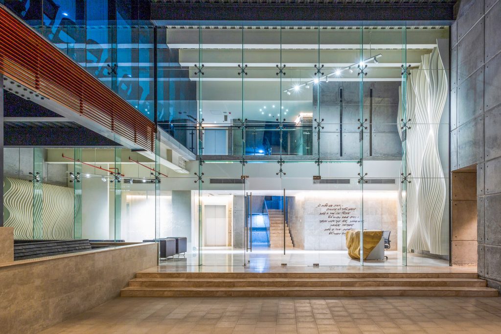
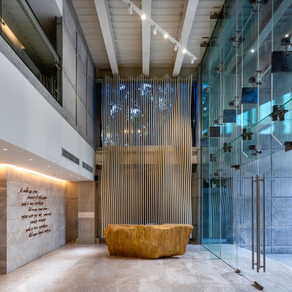
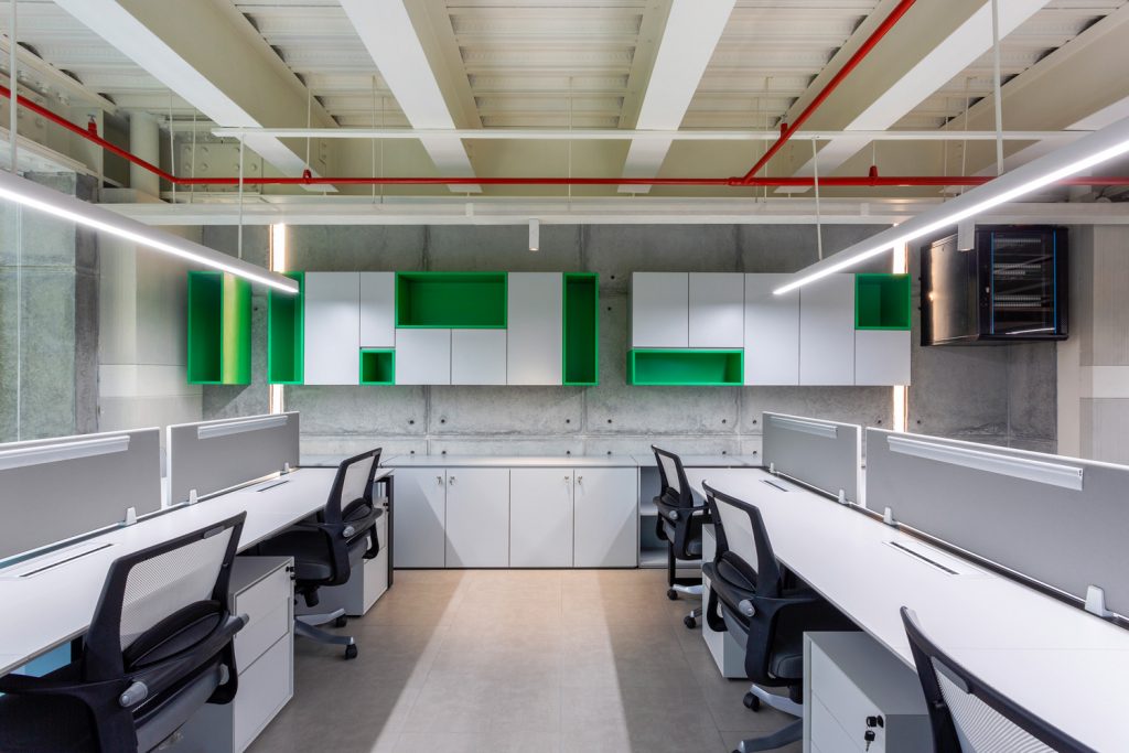
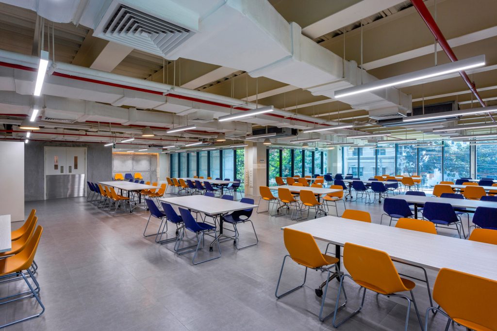
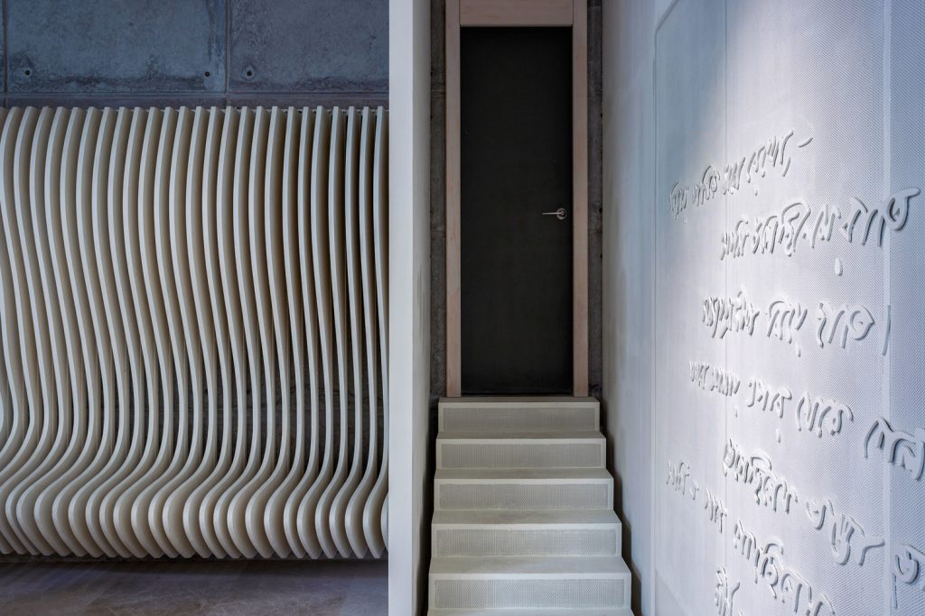
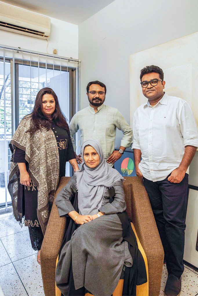
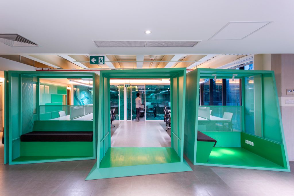
After the completion of the design and construction documents in 2018, Studio Morphogenesis got involved in the design process and started the construction work in 2019. Amidst the pandemic, the project was completed in 2020, exhibiting open office floors, along with reception, lounge, seminar hall, and dining. The design introduces elements, and features, and exhibits the space which has utilitarian value for the type of space or zone it is set in/on while complimenting the existing architectural elements. The architecture of this office building invites more natural lights during the daytime and keeping that in mind, the lighting design was done accordingly with maximum energy efficiency and a proper work environment. The ground floor provides a unique and inviting impression with the sculptural wall and the reception desk. For public zones, large-scale exhibits and thought-provoking installations are situated to create a dialogue with the user or visitor. For formal and private zones, the thresholds and space divisions were defined within a framework of double utility as a gateway installation between two spaces was also defined as the printing station and informal lounging space and seating zone. Bittersweet contrasts among the readymade and custom-made elements were developed to be a major feature of the interior. Moreover, animating the surfaces in various scales and meanings is evident.
Using bright colours from different brands of the company in different office spaces created a vibrant environment.
From the 3rd to 8th floor, the typical office layout is open with only meeting and manager’s room enclosed by glass walls. A design POD was made to create a break-out space for interaction. Furniture was sourced from both foreign and local vendors. Workstations, meeting tables, managers’ desks, and chairs were sourced from different international brands. And POD, cabinets, reception desk, and feature works were constructed by the local vendors. Various materials were explored to make different furniture with unique features. A delicate construction method was applied to build the reception desk. The furniture of the dining area is foldable and stackable to convert the area for any kind of large gathering. The three individual seminar halls also have the option to transform into one large hall.
To modulate with the open plan office ideas, certain features were introduced, customized, and designed where contrasts are presented in space organization through both direct and subtle interventions.
Text by Ferdoushi Hossain Suhi
Redefining Office Spaces – UNDP Country Office, Aagargaon
Achieving the appropriate balance between pioneering and comprehensible concepts is something that organizations, most notably UNDP, strive for in order to boost productivity and worker well-being. The UNDP Country Office spanning the 18th and 19th floor of the IDB Bhaban, Agargaon, portrays a concept that reflects the work of UNDP as well as the lively office culture the company aims to practice. Architecture firm maison’D Architects redesigned the office to bring the company’s vision alive.
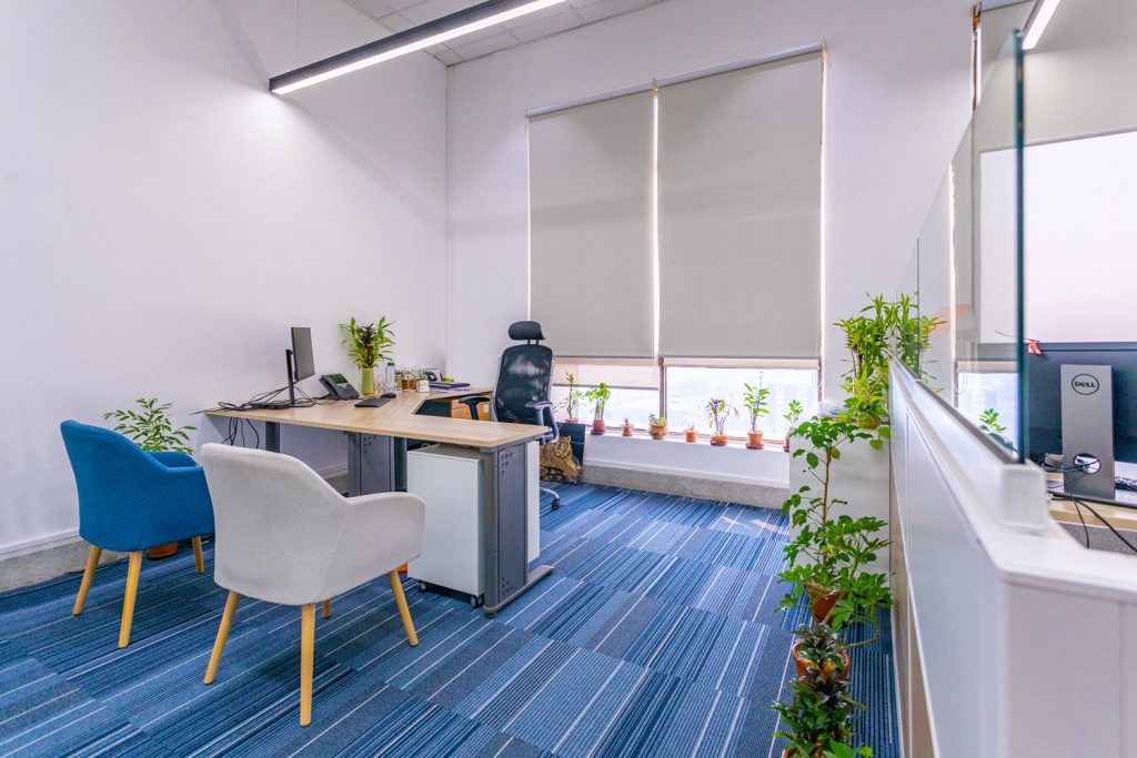
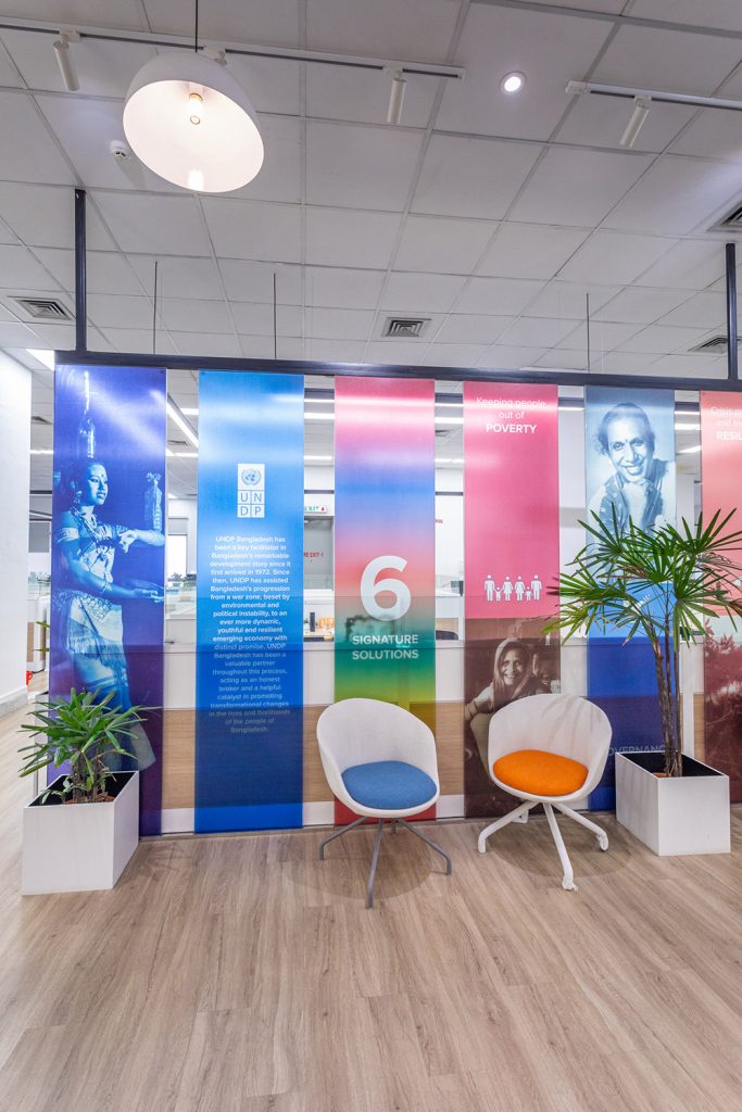
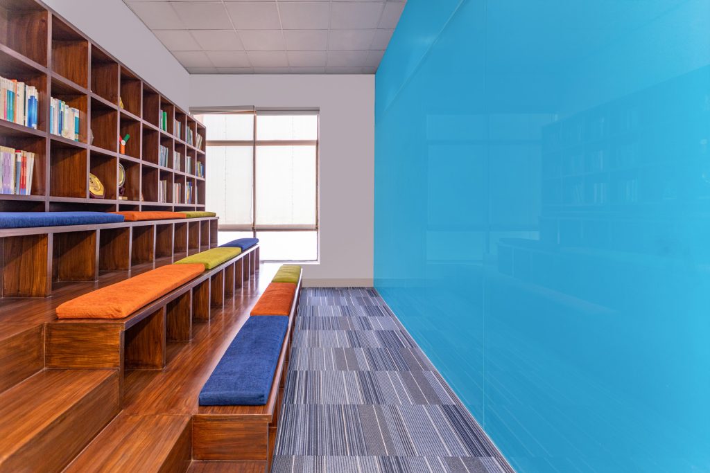
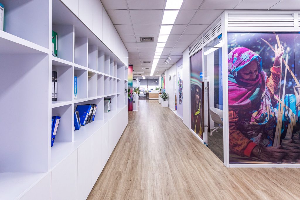
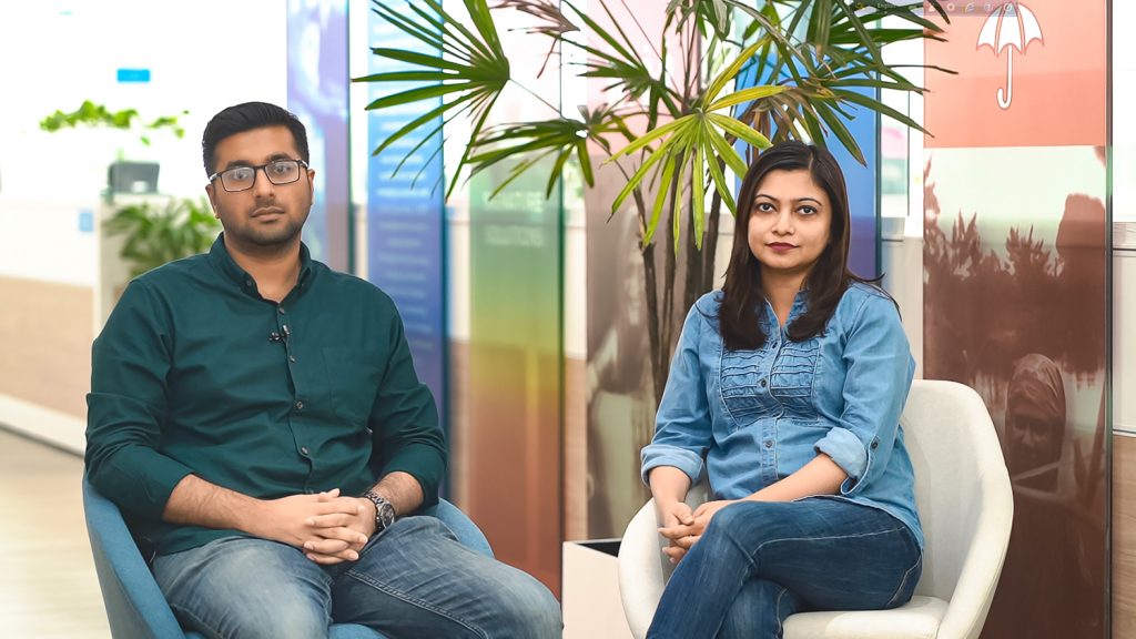
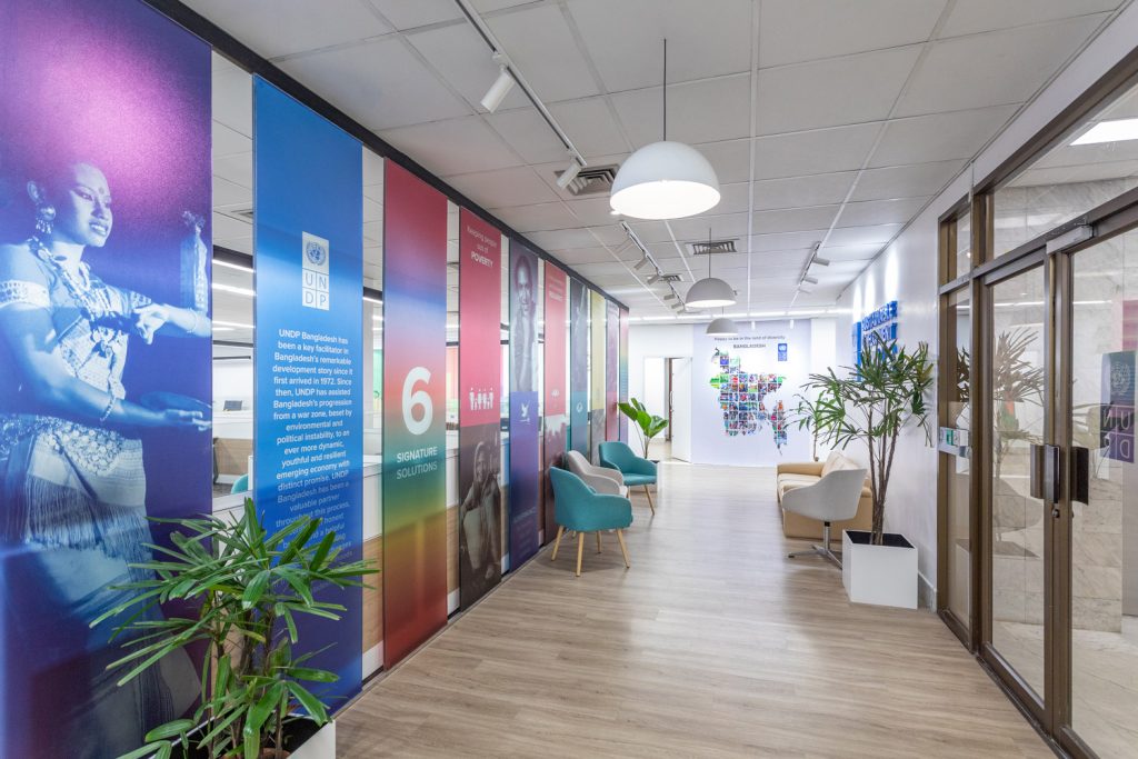
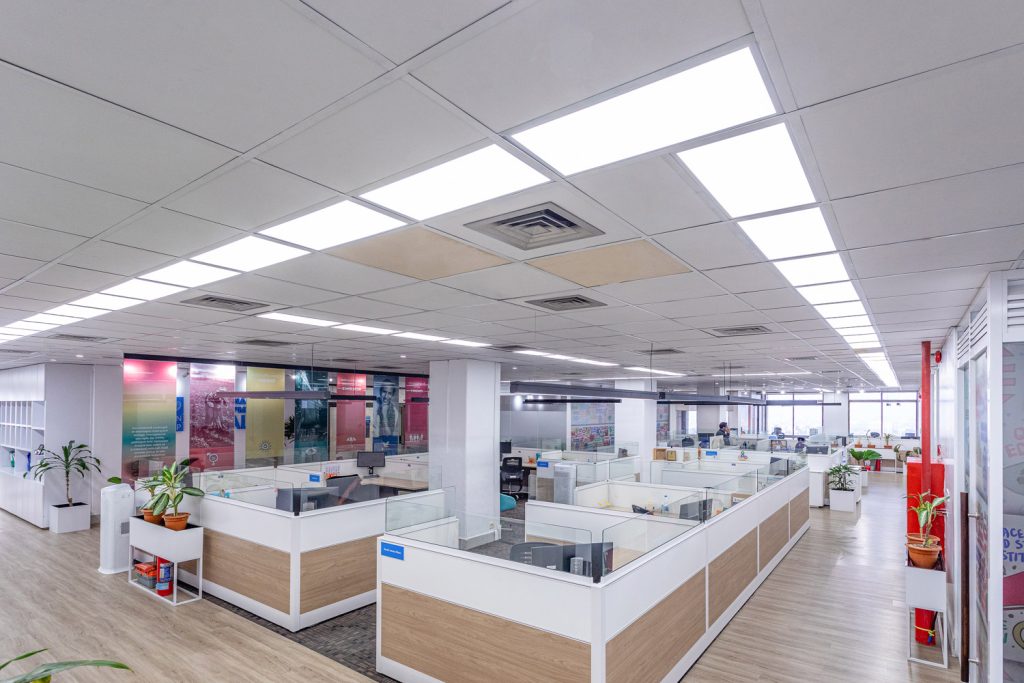
In order to comprehend the demands and objectives of clients like UNDP, maison’D Architects was devoted to working closely with them. Flexible and functional workspaces that promote creativity, productivity, and comfort had been the core design requirement of the design team. The focus was to create an office environment that could accommodate a variety of working and emotional states, from contemplative aloneness to active group interactions. From architect Talha Mahmud, the office’s easy access, natural lighting, and plantation-style architecture allow people to “take a deep breath as soon as they get into the office.” This is because these elements have a big effect on people both consciously and unconsciously, making them feel comfortable and at ease as soon as they enter the workspace, which was not the case in the previous office. The office is based on an open-plan concept, occupying approximately 16000 square feet divided into two floors. The interior of the office puts aside all the unnecessary decorations to represent the most authentic characteristics of the materials. The monochrome tones of the overall project are enhanced with a few graphical walls and colourful furniture pieces that help to break the monotony. “The colors implemented in the décor details are derived from the UNDP company’s prime colours. On top of this, the indoor plants surely uplift the mood and grow employees’ morale and productivity, and creates a pleasant ambiance to get the daily jobs done efficiently. A couple of nooks, as well as a range of breakout spaces, are designed that offer a different level of privacy, suited for a quick chat, a phone call, or an informal meeting,” says Farhin Ashrafi, partner architect of maison’D Architects.
Apart from the continuous flow of linear overhead artificial LED lights installed throughout the whole floor, the wide transparent glass walls of the office allow natural light to flood the workplace, as well as create an illusion of larger spaces. The additional transmission of light into the office environment and the view of the wonderful cityscape tends to lead to more productivity. “By implementing an open plan concept, the office is now more open and transparent. Each individual workstation and nook receive natural light and outside views. Interestingly, each space provides a different view of the cityscape. For the employees, it is delightful for them to watch the changing panorama from different angles at different periods of the day”, shares the design team.
The office design uses elements like lighting, ventilation, pop of colours, and shapes to compose an environment that promotes interaction and contributes to the team’s effort.
The UNDP Country Office is indeed a combination of brilliant functionality and modern eclectic style.
Text by Tania Ahmed Nishi
Connecting to Nature – The Wind Lounge, Rampura
The culinary escape, the Wind Lounge, located on the rooftop of Islam Tower, Rampura, provides an immersive experience for the occupants living in the hustling and bustling capital. Surrounded by soothing vegetation and fauna, a calm and secure environment is adopted by architectural firm Cubeinside Design Limited, where one might dine and drink in peace.
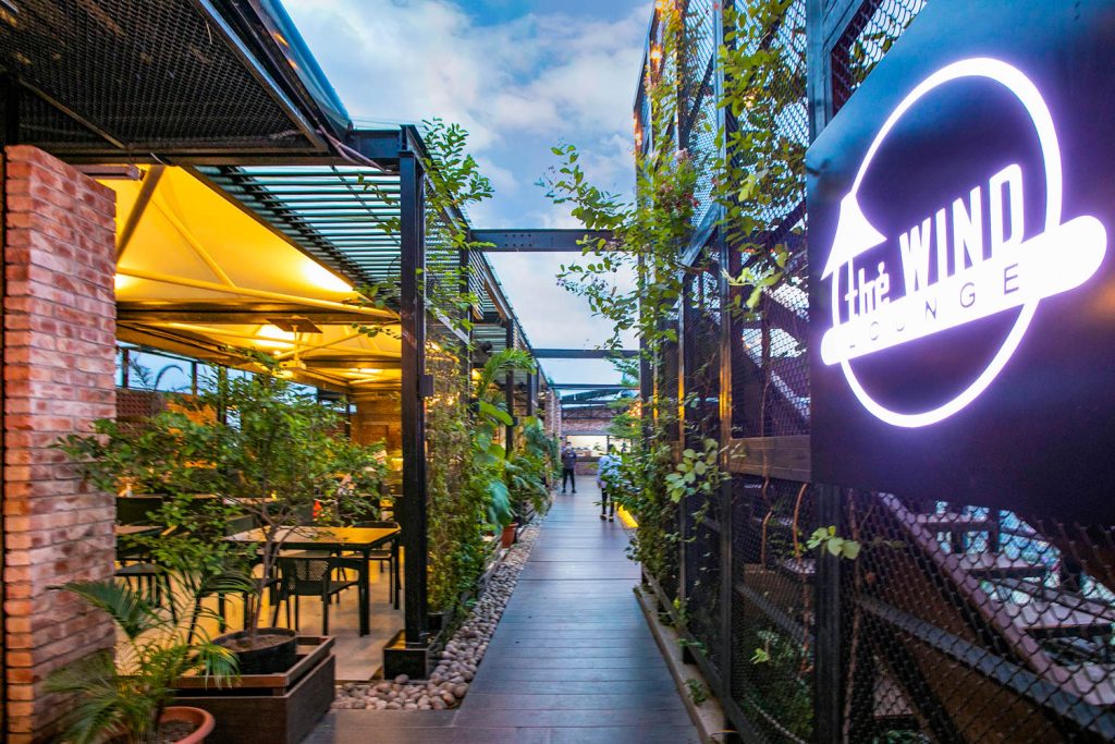
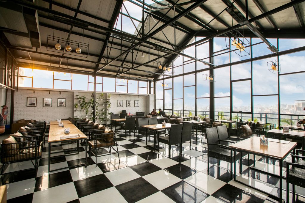
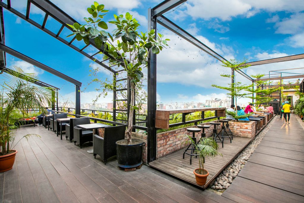
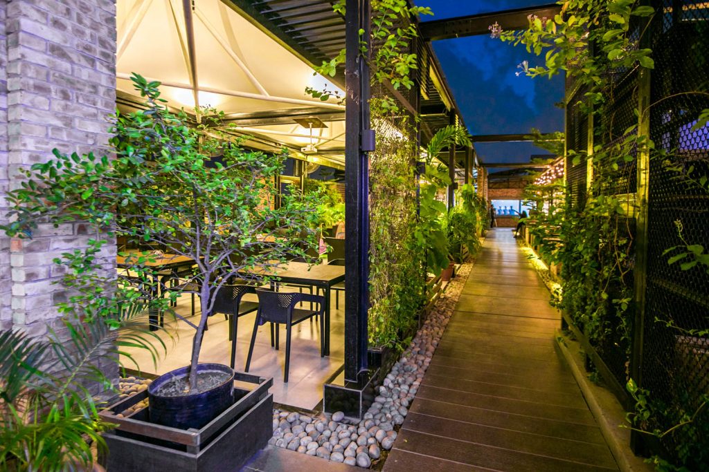
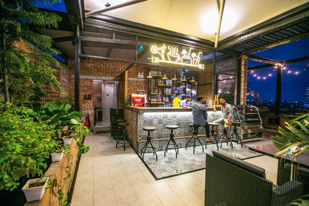
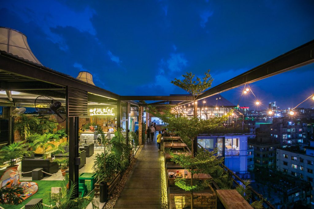
The restaurant underwent long construction. Following the long construction period, the design experienced every season of the tropical land – be it the scorching summer, high humid days or pre and post-monsoon with heavy precipitation. Hence, the plan layout was adopted according to the varied seasons to secure climatic comfort for the occupants.
The restaurant is sectioned into different zones – semi-open, open and closed, to get multiple experiences.
“When it rains, diners sit in the closed zone, beside the window area, usually with some hot coffees/teas on the table. The storming hot brews, the sliding raindrops off the glass panels, the drizzled sound, amalgamate into sensual pleasure, both in visual and audible,” shares the design team. “On hot and humid days, eaters opt to dine in the semi or open outdoors. The background wall in the tented semi-open space, opposite the Hatirjheel view, is designed as a perforated screen to aid in cross-ventilation. For this, eaters find the shaded place naturally cool due to the smooth airflow. The ultimate goal was not only to meet the functional requirements but to give diners a mesmeric experience by its natural design phenomenon.”
The restaurant adorns natural, local materials, wooden furniture and wooden walkways to give a warm and organic feel. Besides, the stone and gravel pathways accentuate the sensory experience. Mechanical lighting has been adjusted, prioritizing the external light levels, sectional spaces, and the warm colour palette of the place. These considerations underscore the restaurant’s attention to detail in the customer experience – taking care of the customer, from ambience to intuitive service and stimulating food and drink.
A significant aspect of the restaurant is the implementation of vegetation. The diverse planters or the creepers draping the screen wall have been locally sourced.
The plantation acts here as an essential element to mitigate sun exposure, moderate the view from the interior toward street traffic, and ventilate the smoking area on the terrace.
Collectively, the use of simple low maintenance materials, the advantage of natural lighting and ventilation, and the practicality of the open floor plan were also complementary strategies for fulfilling this project. Another intriguing part of the restaurant is the tented roof of the semi-outdoor space. “Interestingly, from a fair distance, people anticipate the restaurant by the three tents on the roof. Moreover, people riding boats in the Hatirheel Lake can foretell The Wind Lounge by the tents. Hence the restaurant has become a sort of landmark substantially”, shares the team.
Text by Tasmiah Chowdhury
Atmospheric and Authentic – Zephyr Restaurant, Banani
The name “Zephyr” is a testament to the serene ambiance of the restaurant Zephyr, which is situated on the rooftop of Catharsis Tower, Banani. Zephyr’s interior is shaped in such a way that it supports the establishment’s authentic expression, and all appreciation goes to the ‘I3 in Architecture’ firm which was delegated for the entire interior design.
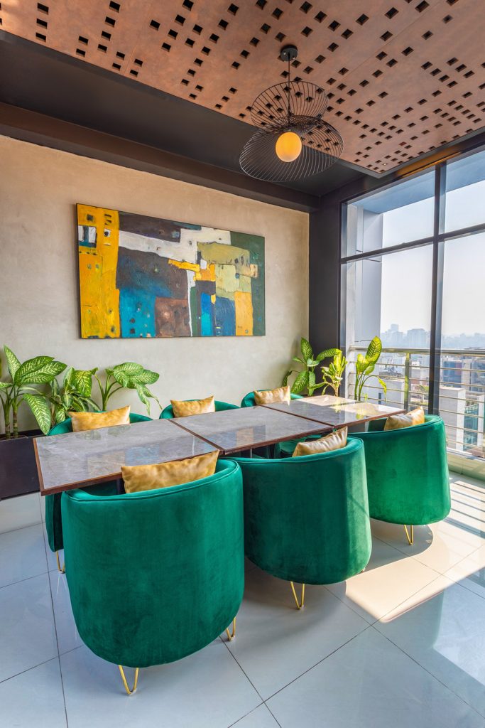
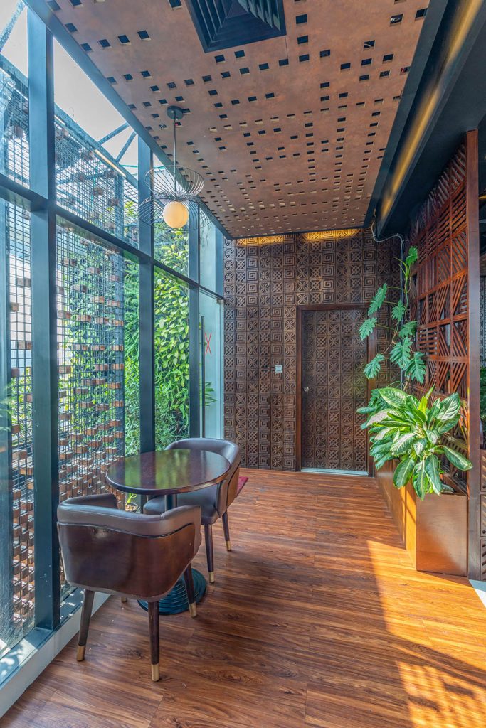
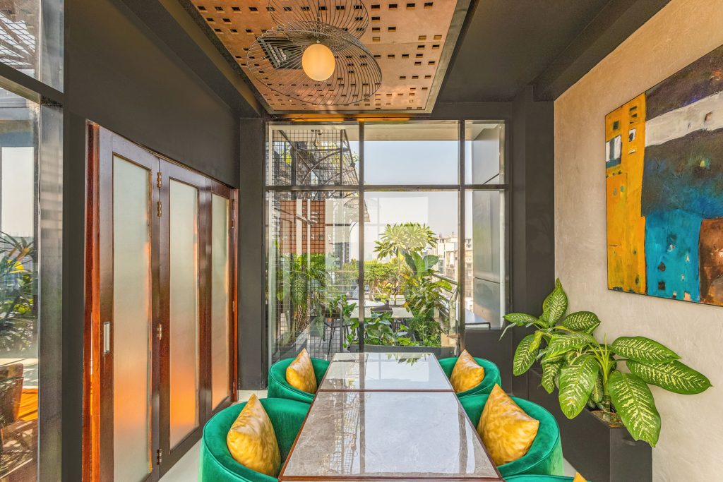
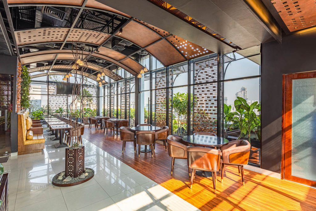
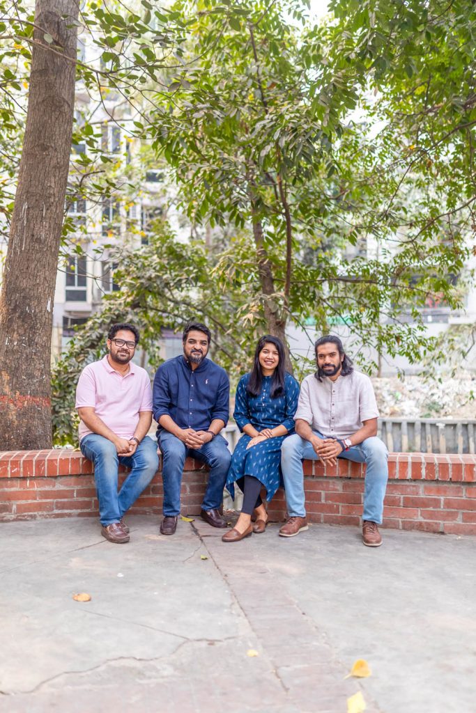
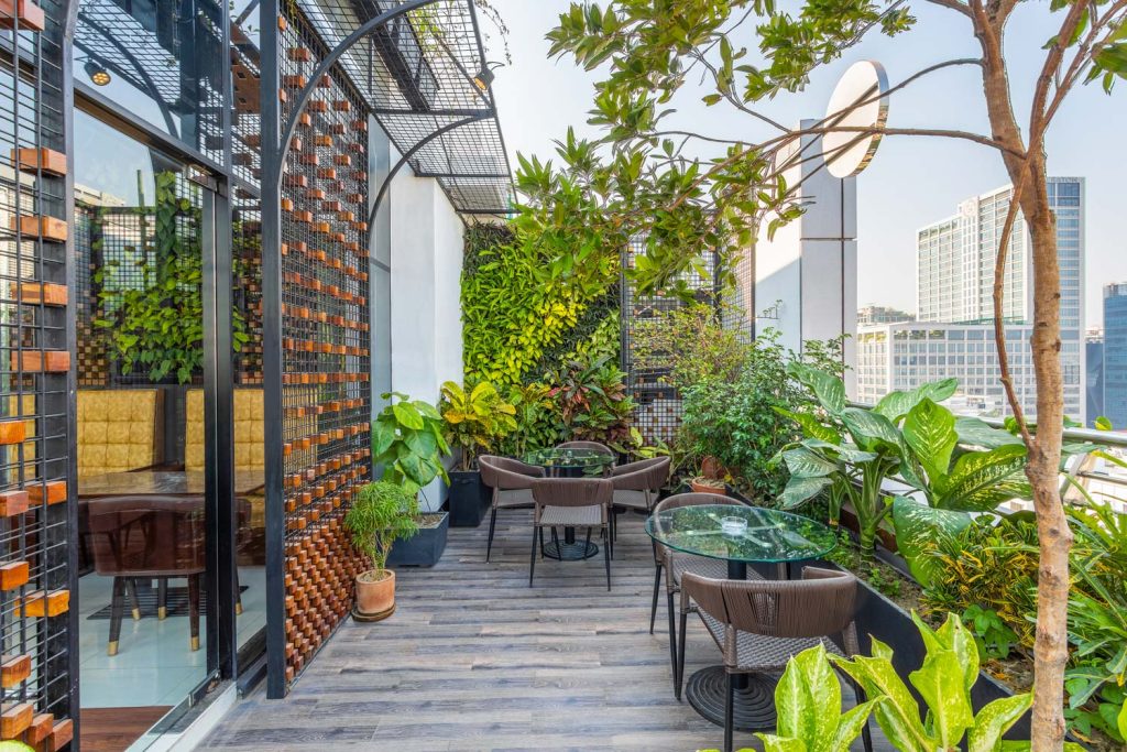
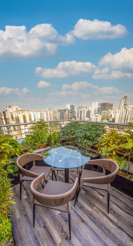
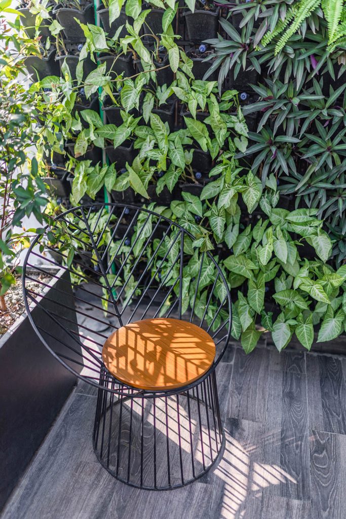
The ambiance has a calming effect due to its lush foliage that adds much-needed greenery to Banani’s industrial landscape. “The main goal of this venture is to “bring the outside in.” It is not merely seen as a visual link between interior and outdoor spaces; rather, it is seen as an extension of indoor spaces through design aspects”, expresses G.M. Hasanuzzaman, principal architect of I3 in Architecture. “Since the site is on the rooftop, the view of the sky and the dense city fabric act as a backdrop for the restaurant. The metal frame and floating wood blocks provide a fascinating geometric pattern of light and shadow that helps to create a distinctive ambiance. In contrast, green is layered to counteract the visual heaviness of the metal and wood”, continuing.
To make the dining experience more relaxing, the main dining vaulted hall was connected to garden patches on all four sides. In one of the corners, a private room is set up for social gatherings or business occasions. Consequently, the kitchen area is kept behind the whole space with the buffer of the counter area from the main approach to keep the whole service area (kitchen and toilet) in one corner which was necessary for minimizing the technical/operational difficulties. “The delicious and exquisite continental cuisine is worth a visit to Zephyr; it is the place you need to go whether you want a taste of nature, a feeling of calm serenity, or just some simply stunning photography”, shares Kazi Motahazzad Billah, Managing Partner of the restaurant. Zephyr’s overall boho-chic interior design was taken into consideration when designing all of the furniture. The restaurant’s design strategy required them to consider each component and detail separately. A metal and wood screen were created to serve as both an interior aesthetic feature and a shade mechanism.
Every element in the restaurant is designed thoughtfully including the traditional motifs of the walls, the arched ceiling, the sculptures, paintings, drainage, and the maintenance systems of the plants. One of the striking elements of the restaurant is the painting hung in the corner room which is meticulously designed by artist Israt Jahan Teesha.
From architect G.M. Hasanuzzaman, construction of the restaurant started in the second week of June and ended in August. So, it took two and a half months to complete the construction. Coordinating with building developers, and providing proper heat insulation, and drainage systems had been some of the challenges the design team faced during the construction.
The restaurant experiments with mixing industrial hues like black and metallic tones with organic hues like green and brown wood.
In addition, task lights and focus lights are employed to enhance the spatial experience and meet the functional requirements of a restaurant, while natural light is regarded as the primary source of lighting.
Text by Tania Ahmed Nishi

