Bariq & Co, the trendy footwear retailer renovated their Banani Kamal Ataturk store, revamping it to fit the sophisticated charm of their shoe design. The interior was done brilliantly by the design duo of Thinkspace Interior Design Studio Reeta Ameer Yusuf and Lava Biswas Nandini.
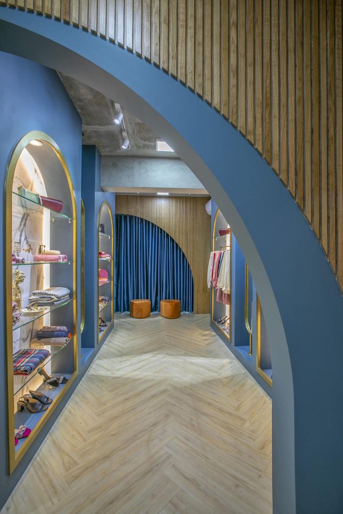
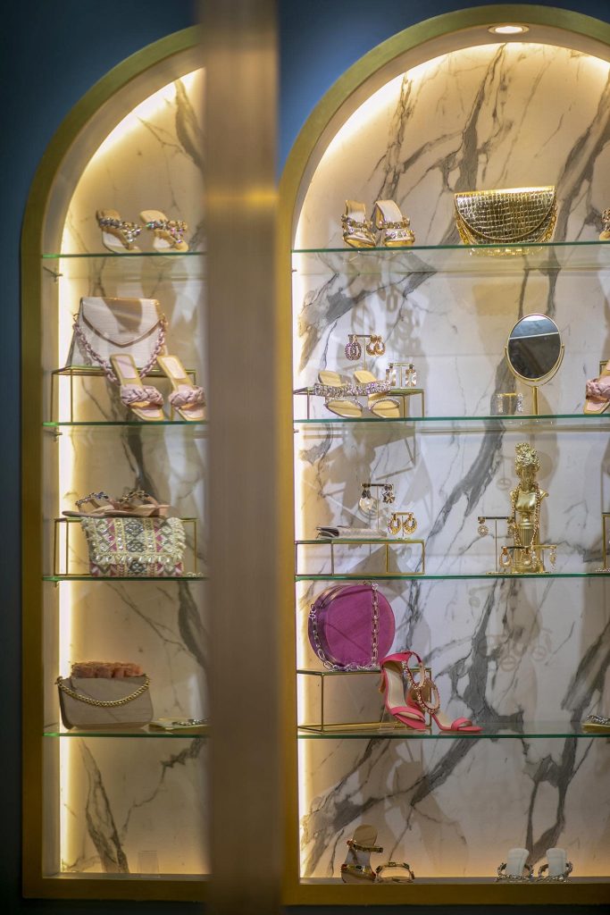
The freshly renovated store does not only boast a fresh coat of paint but rather was given a much-needed makeover, a total rejuvenation of space. The owner of Bariq & Co. Badria Anis had very specific needs when it came to the design requirements. She did not want her store to look like all the other trendy stores. Therefore, it was up to Reeta and Nandini to come up with a fresh new design that would set the footwear store apart from the rest.
Badira Anis contacted Thinkspace’s Facebook page in 2021, right at the tail end of the pandemic ending. Since Bariq was growing, the owner wanted a bigger space to handle the growth, and thus she reached out to Thinkspace. The client had very clear requirements: she wanted a sort of experimental design, that would give off a studio vibe. The proposed concept was very modern and contemporary, with bold use of unusual colours and patterns that somehow work together. It took Thinkspace an entire month and a half just in the design process of conceptualizing their clients’ needs and requirements into a tasteful design that they could be proud of.
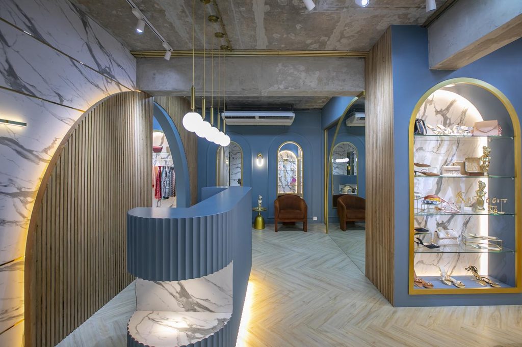
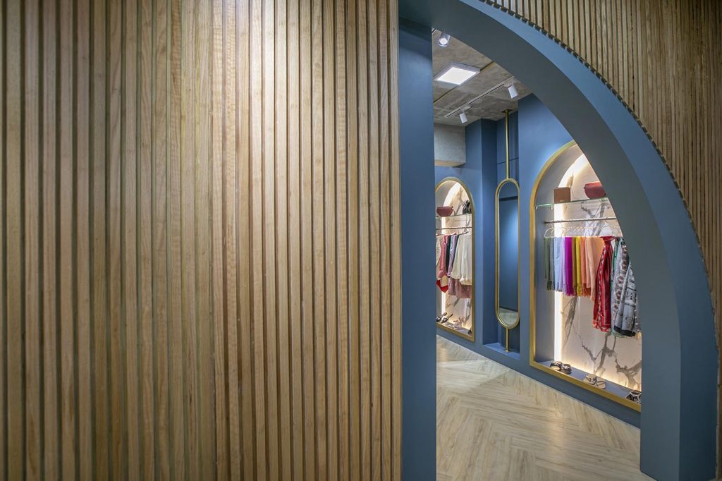
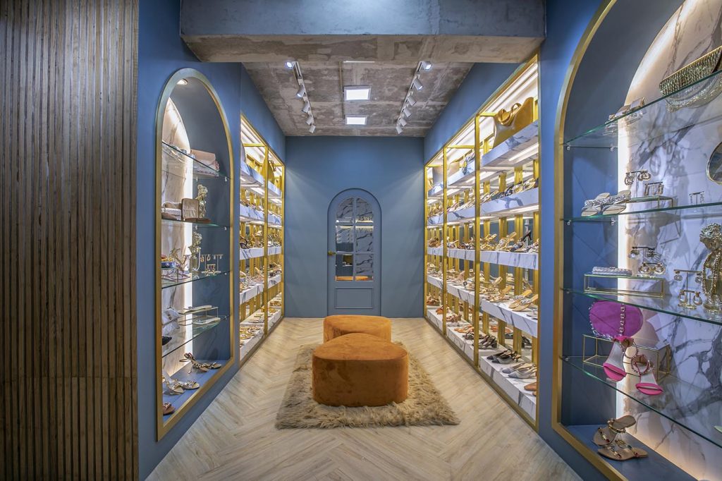
The space is around 650 square feet, and Thinkspace tried to manage the tight space by employing mirrors that would reflect, deflect and make a small space look bigger and brighter. The mirrors also help the customers get a better look and feel of the shoes when they are trying them on. Even though the space is small, keeping all shelvings on the walls and creating a walkway helps to alleviate any obstruction. The design duo picked a bold greyish blue as the main colour of the store, with gold accents and white marble patterns to contrast. They even left the ceiling untouched as the new displays had enough lighting, and a ceiling design would just make everything look overdone. The raw ceiling was given a slight makeover with some paints, track and surface lights. They used natural wood texture on the floors and in certain accented places to balance everything out. The choice of blue sets Bariq’s store apart because typically blue is not a colour one would pick for a store, and yet Reeta and Nandini made it work for Bariq’s interior.
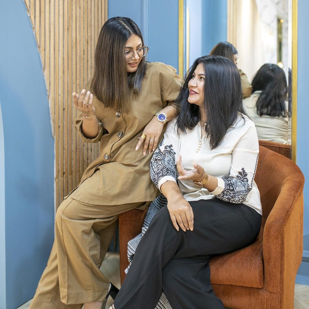
An interesting design element used in the store interior is the use of arch shapes. Nandini and Reeta always wanted to play with this shape in a space and Bariq seemed the right space to test that out. The illusion of a bigger space is created by cutting a round shape and pushing that through onto another surface as a continuation.
“Design is all about free flow. It is about function and how it flows through a particular space”
says Reeta. Therefore it was crucial to have an ergonomically solved walkway in the store, as this is a shoe store and people coming in will be walking around the space more than in other shops. The store for Bariq & Co. is the result of a meeting of the minds and matching of design style and taste for owner Badria and architects Reeta and Nandini.

