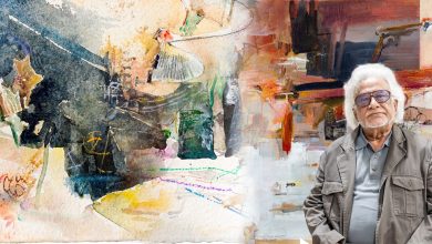
“A home should be rooted, not decorated”, a belief personified by Architect Sudeshna Shirin Chowdhury through Charubithi 3B. Situated in Gulshan 1, the 3,500 sqft apartment embodies the dual spirit of a contemporary and classic home.
The principal architect for architectural and interior design consultancy studio, Studio.O, Sudeshna Shirin Chowdhury explained her belief that homes should represent the owner. She states, “As a designer, I like to shape each and every space according to the person who is actually going to use the space.
For Charubithi 3B, the approach had been to create a layout where every individual member of the home had their own comfort space while also creating functional communal spaces.
It was distributed in such a way where everyone can all sit together, enjoy their time together and have their private time as well.”
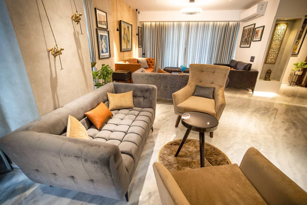
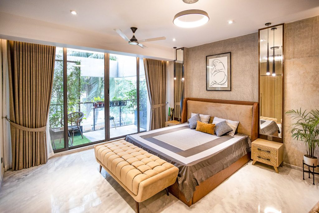
Noting the client’s vast personal art curations, the architect revealed that a very neutral earthy palette, mostly greys, browns, beiges and whites were incorporated in order to complement the paintings. The completely new apartment had been a shell with only the ceiling and floors being finished, Studio.O took advantage of this creative freedom through hand picking all construction materials and creating all internal partition walls as per their requirements.
The work for the project began around September of 2020; not without its hurdles, it reached completion and was handed over in March 2021. “What we tried to do in this project is to source everything locally. Each furniture piece was locally purchased. However due to the project dates coinciding with the pandemic, it was quite difficult to source a lot of the necessary materials and the available labour force was also quite scarce.”
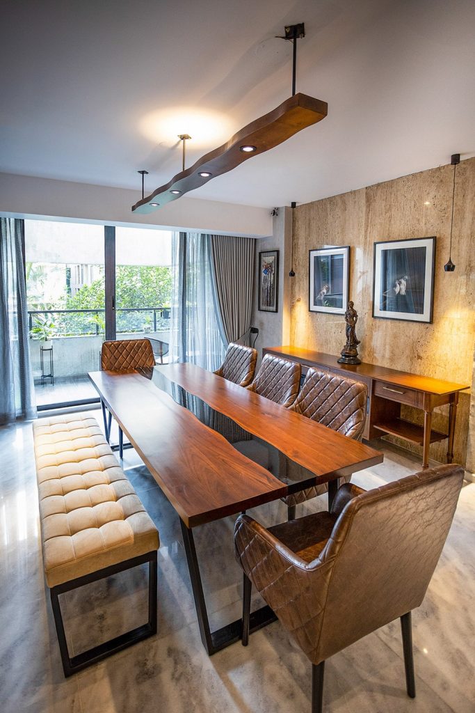
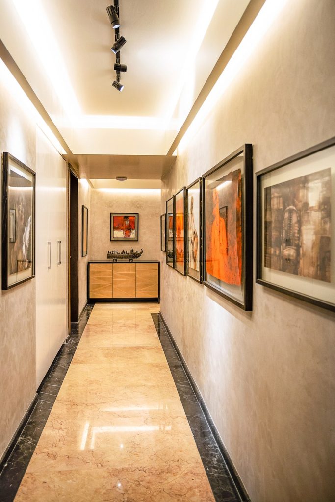
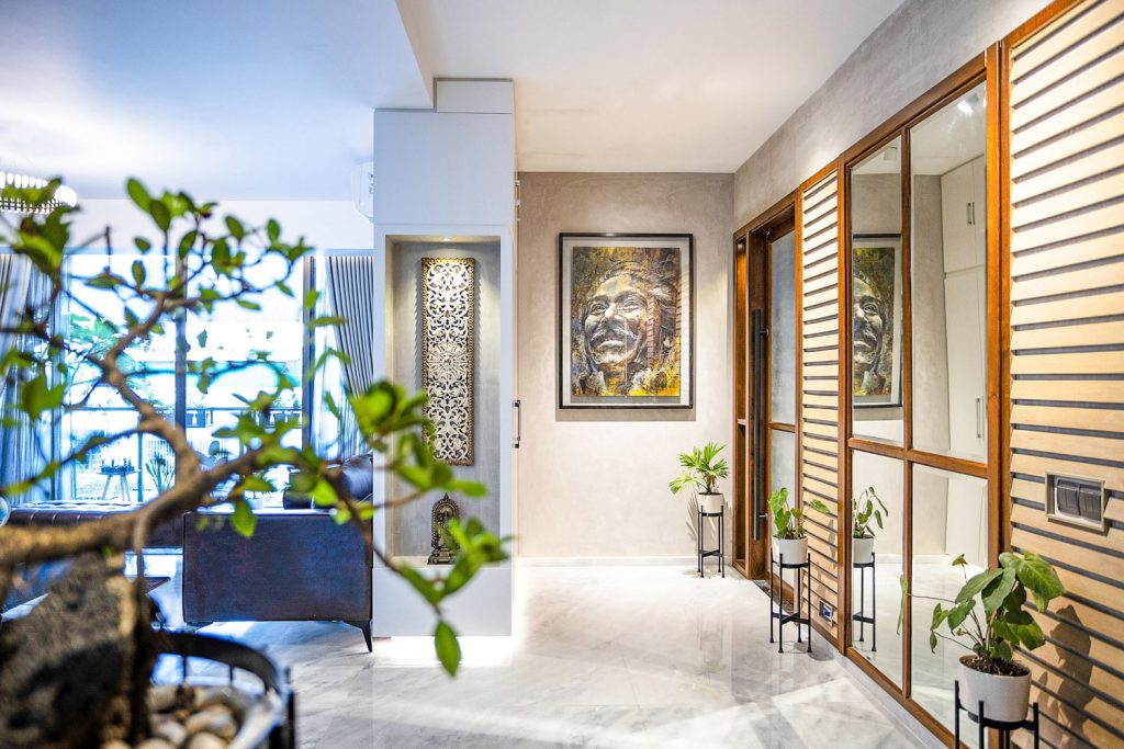
Highlighting the primary use of marble tiles, different shades of wood, concrete, experimentation with shades and textures of skim coats, Architect Sudeshna Shirin Chowdhury states, “We tried to keep it very neutral. We incorporated travertines in some walls, placing artwork or a mural that reflects the travertine on the wall it faces. There was a wall where we created the illusion of the wall being a window, strategically placing mirrors, this also created an elongating effect on the corridor opposing the mirrors. There was also a feature wall which the client themself painted, so it was a fun part. For me, the great part about this project was my relationship with the client, it was proper teamwork.”
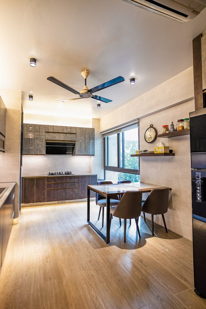
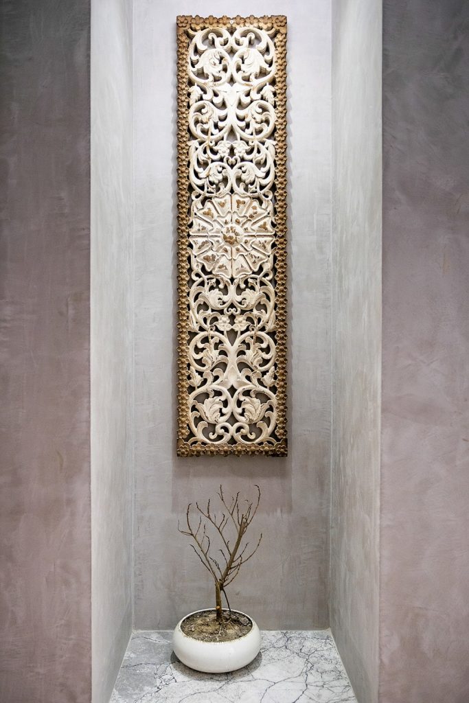
Chowdhury called attention to the cabinet visible on the right hand side upon entry, disclosing that it is actually a shoe rack which was discreetly hidden through the use of strategic lighting and an alcove. She states, “There is actually a lot of storage in odd places scattered around the apartment that completely blends into the surroundings, which in itself is a feature of the home.”
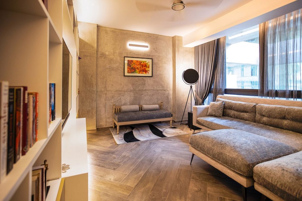
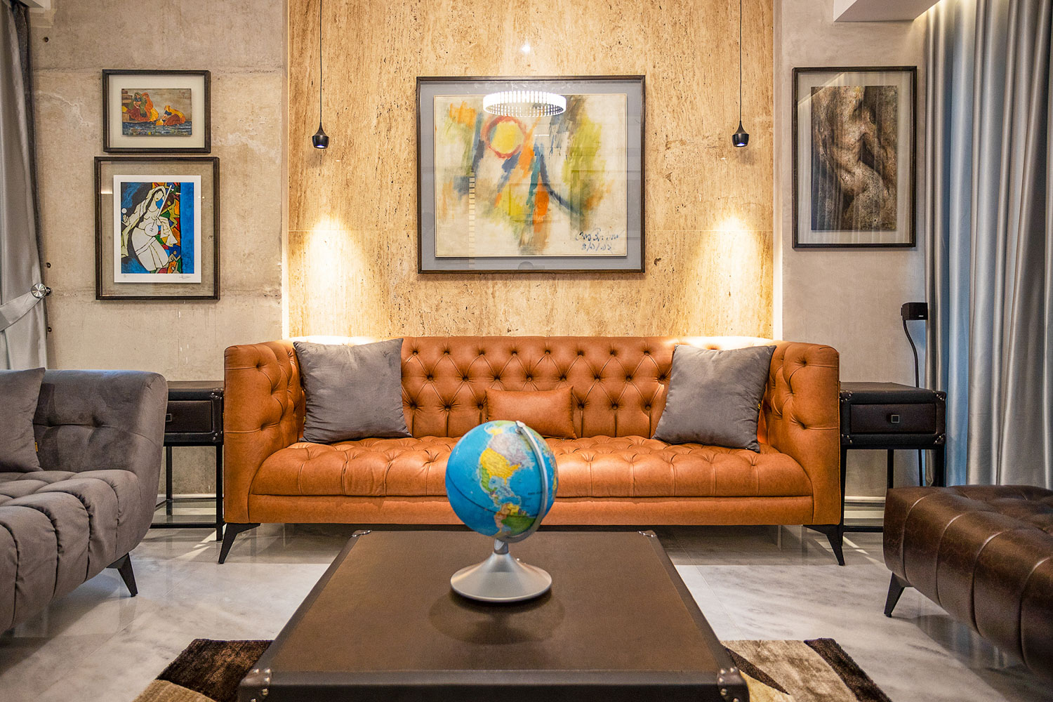
“We retained at least three kinds of lighting that can be changed according to necessity. The corridor walls are adorned with concrete paint and paintings. A lot of indirect light was used, the spaces were illuminated in a way to create focus and highlight the objects the client wished to display.”
The architect explained the unique design of the home, noting that the apartment itself is a square layout surrounding a core. The lift and stairs are in the core, hence the home connects itself in a loop with a corridor running throughout the house. The corridor is the main walkway connecting the house, at a point leading to the kitchen with the family living area on the opposite side, designed in a manner to accommodate the family’s needs.
Chowdhury states,
“The client had a particular style and preference. A very successful individual themselves, they have their own manner of thinking and criteria. We worked like partners to achieve what was most appropriate for them.”

