Sited on the concrete jungle of the densely populated area of Mirpur, the Sony Square is a contrasting breath of freshness with its nature-inspired design highlighted by its open-to-sky atrium. The client trusted the architect Rashid Mahim and his firm Amur Architects to renovate the design of this forty-year-old landmark building. The Sony Square corporate office replicates the serenity of working with the essence of the countryside in an urban setup.
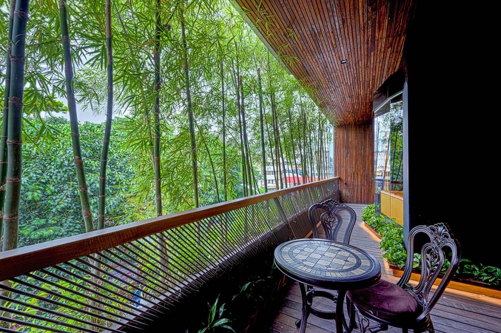
The architect approached the design with the concept of recreating a working environment of a corporate office in a domain inspired by nature. After observing the design of the green lounge, the client had confidence in Rashid Mahim and his ability to deliver and thus gave him full freedom to curate the space as he envisioned. The well-recognized building of Sony Cinema had various programs that included Sony Square office space, shopping mall, lobby, food court and a rooftop restaurant that was brought together with a large 5-floor high atrium that open the space up to nature. While planning the overall program zoning of the building, the architect changed the allotted site for the office and presented a plan for the 3500 square feet of space. The architect took inspiration from his village environment at the bank of Padma and proposed the layout which, consequently, had the organic graphical imprint with its curved circulation that connected all the spaces together. Not only on the two-dimensional layout but the natural forces were also prioritized in three-dimensional as well. The ceiling, with its levels of featured surface, brought on the dynamism that can be seen in the canvas of the sky.
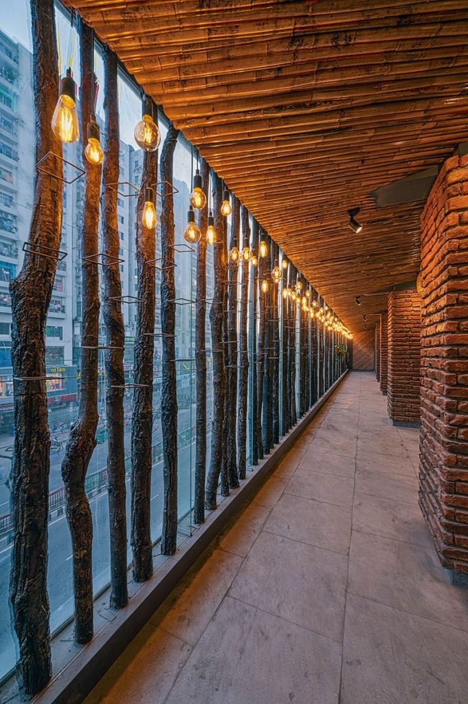
The existing beams and columns became an intricate part of the design element rather than a hindrance.
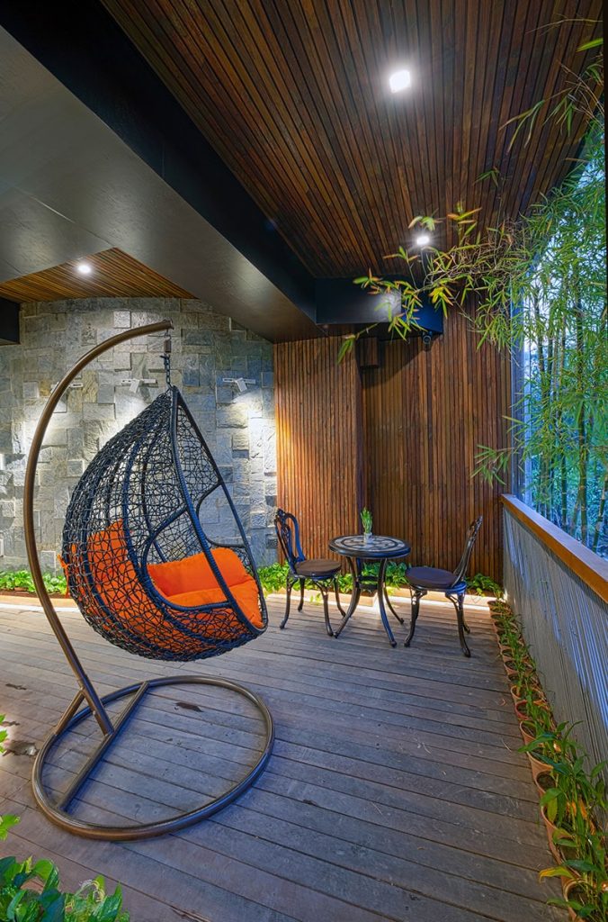
Moreover, the exterior and interior are intimately merged with conscious design decisions and the choice of materials. The office space is adorned in both raw, locally sourced material as well high-end, imported material with a fine polished look. The wall is embellished with the sophisticated look of marble that also gives the impression of a mud wall with its eye-soothing earthy tone of colour.
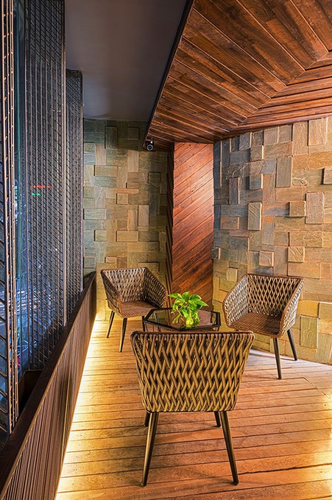
Woods from the thresholds of the old building are reused and all wooden textures are kept raw with no extra colour coating.
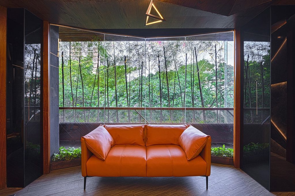
To highlight the natural colour tones, which are an integrated part of the design process, the floor is kept neutral. Just like in nature, hierarchy in colours is observed with the pop of orange furniture of streamlined-modern furniture. And finally, to bring nature closely into the threshold, the columns are framed in black glass panels where the trees on the outside are reflected, covering the whole space vertically and creating the feeling of being inside a forest full of trees.
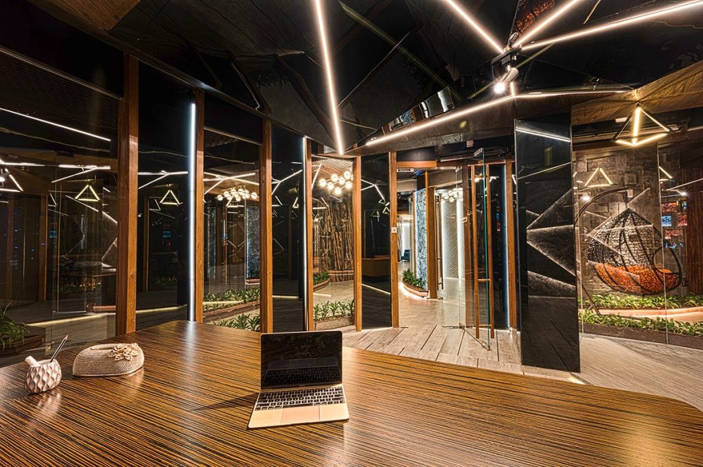
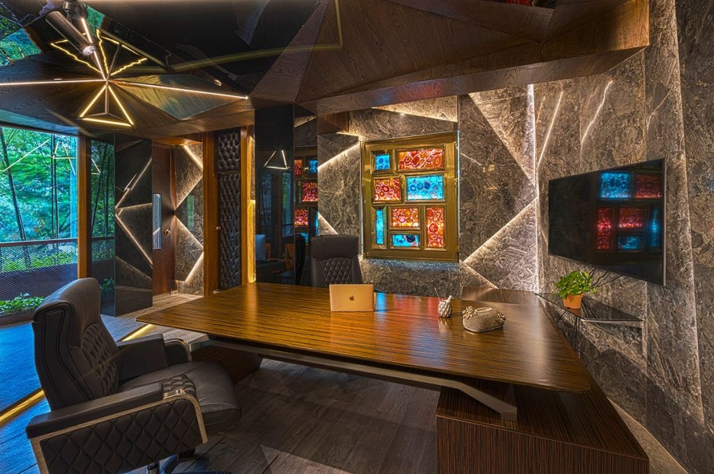
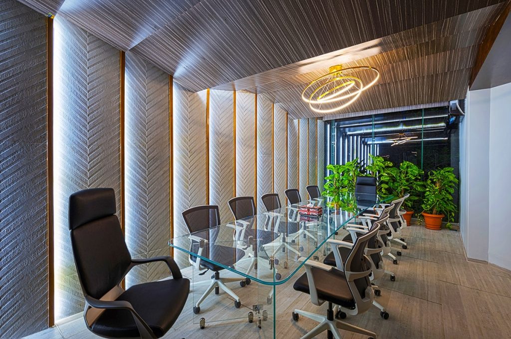
The office space, completed within just six months, is an image replicated from nature. The whole building is designed with a similar concept that was achieved with ease with an open to sky atrium that flooded the space with natural light and promoted connectivity and interaction of different programs. Simultaneous design alteration along the construction process and its fine detailed finish characterized the office into a welcoming, lively working space that is elegantly rooted in nature.

