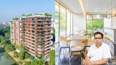
A store’s design format and configuration is a gigantic factor in getting those immeasurably essential deals. Noir is a one-stop answer for global style patterns. It is a youth- driven attire and accessories retail brand where the aim is to give the most ideal support of the considerable number of clients. The designs are one of a kind, our amounts are constrained and our styles are continually changing relying upon seasons and trends.
At Noir, they center on keeping tradition untouched; in any case, they design their items around the cultural sense of Bangladesh – accordingly, the design is known as a combination between the East and the West.
As of now, the brand has 4 stores in Dhaka, Bangladesh. Noir is a concern of Evince Group, the main producer of articles of clothing and materials in Bangladesh. The showroom is two-storied and quite liberating size wise. Even though it’s a clothing store, the decorations stand out and are one of the most significant features.
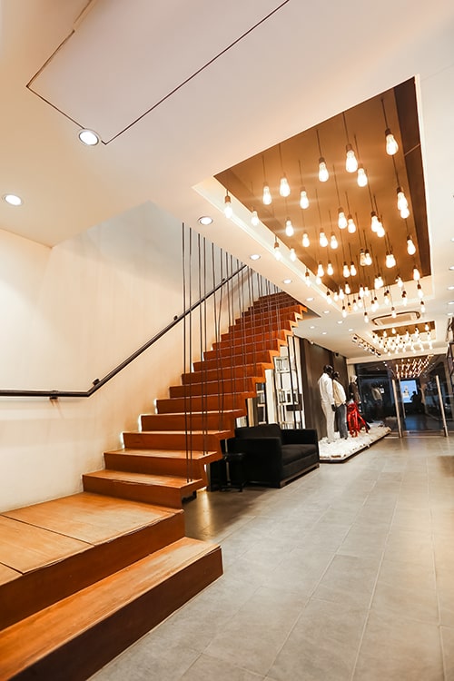
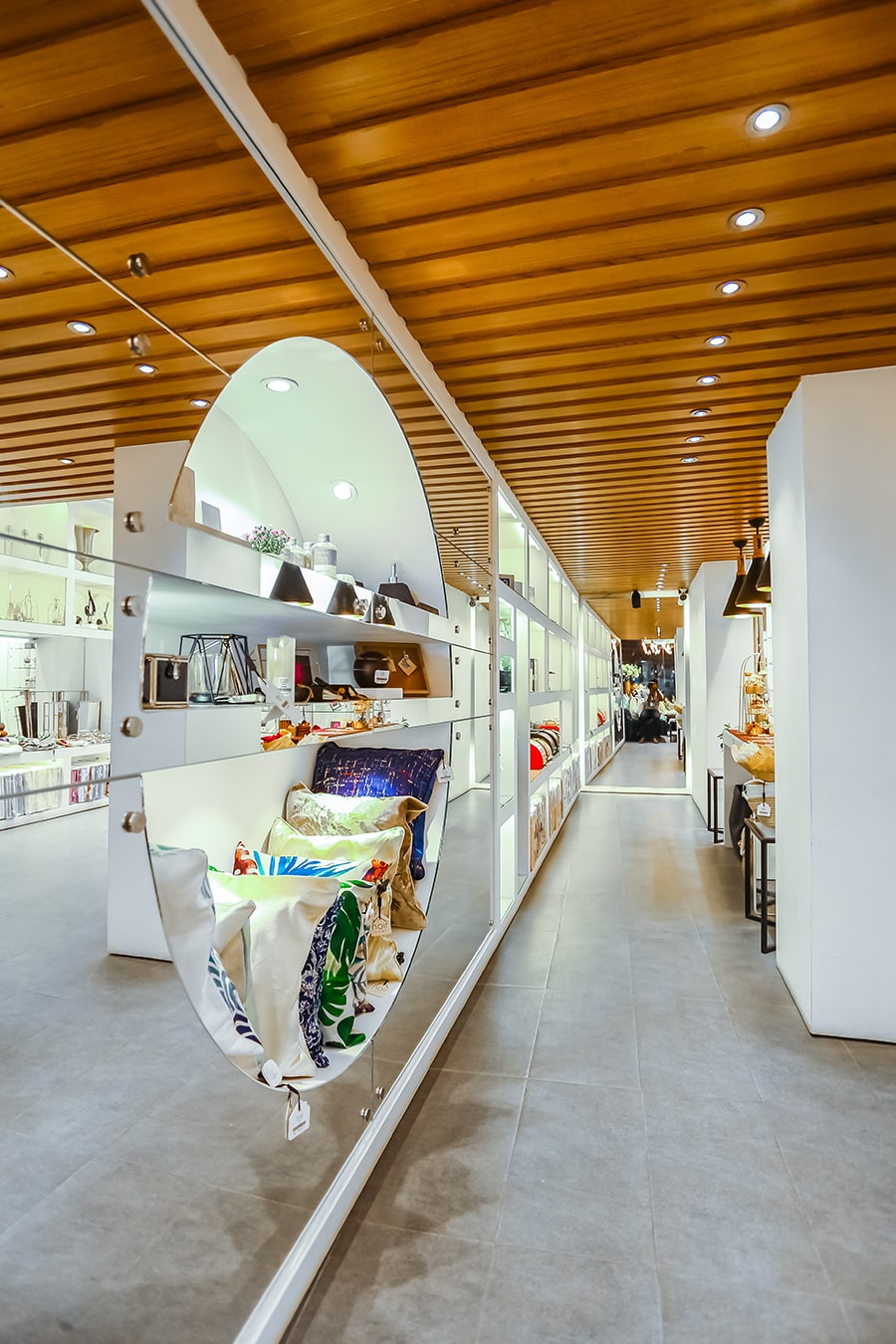
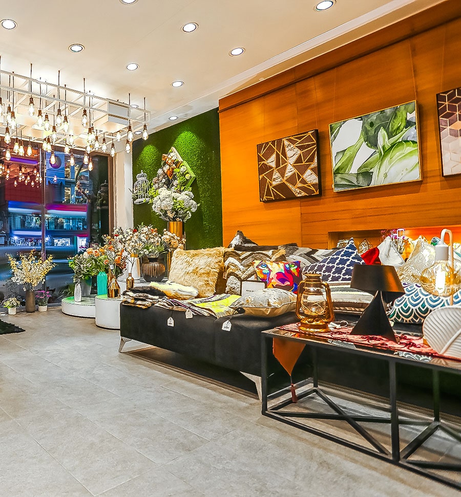
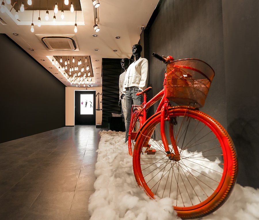
The number of decoration accents is beyond blissful. It adds to the perfect, mess-free feel that makes the space look bigger than it truly is. The store is complemented with deliberately set lighting to give more concentration on the featured product. Noir figured out how to fuse green or living walls into the spaces. This Garden on The Wall provides an association with nature. The well-considered way makes an increasingly charming visit to the store in light of the fact that the traffic is controlled and quickly emits a zen-like climate to the shop. The consolidation of conceptual craftsmanship on the store has certainly made the store intriguing and eye catching for clients. The additional wooden surface in the in-store structure idea gave the shop an energetic look in contrast with a level divider surface. It does not just draw the eyes; it likewise makes the store look bigger. Putting brilliant hued and printed texture has accomplished a similar impact for a retreating space. The wall is coordinated with the remainder of the store, utilizing impartial hues for furniture and floor. The lights and the general lighting makes the spot look pleasant and brilliant, similarly, as it ought to be. The mirrors are set with consideration to make some degree constrained space and made it look open and greater. The idea of Noir works around a topic that goes between a tough way of life and solace just as underlining the most recent commercial center advancement while fortifying the realness and legacy. The store is secured with wood boards and shafts, theoretical craftsmanship, striking utilization of hues emitting the provincial appeal, and setting the general climate of the shop.
